This is the first South African ink that I’ve tried, and I was not disapointed. This is a small bottle of ink, only 20ml – but I love the way this bottle has been designed, it’s made from glass, which I always prefer, and has this cutout in the cap with a visible silicon seal. Besides giving a really unique effect, it makes the bottle immediatly stand out when opening my ink box. The translusent type silicon seal also hints at the colour in the bottle. If they sold this bottle seperatly I would add a few in my collection to use as decanters while travelling.
Frara Road Pine Street Blue Bottle Front
The silicon seal in this bottle was added to allow the user to use a syringe to fill cartridges without even opening the cap – this is genuis. Not just for cartrige filling, but also for getting the last drops of ink out without making a mess. (I’ll be honest though, I have not had a chance to give this particular method a try.)
Frara Road Pine Streen Blue – Top Of Bottle
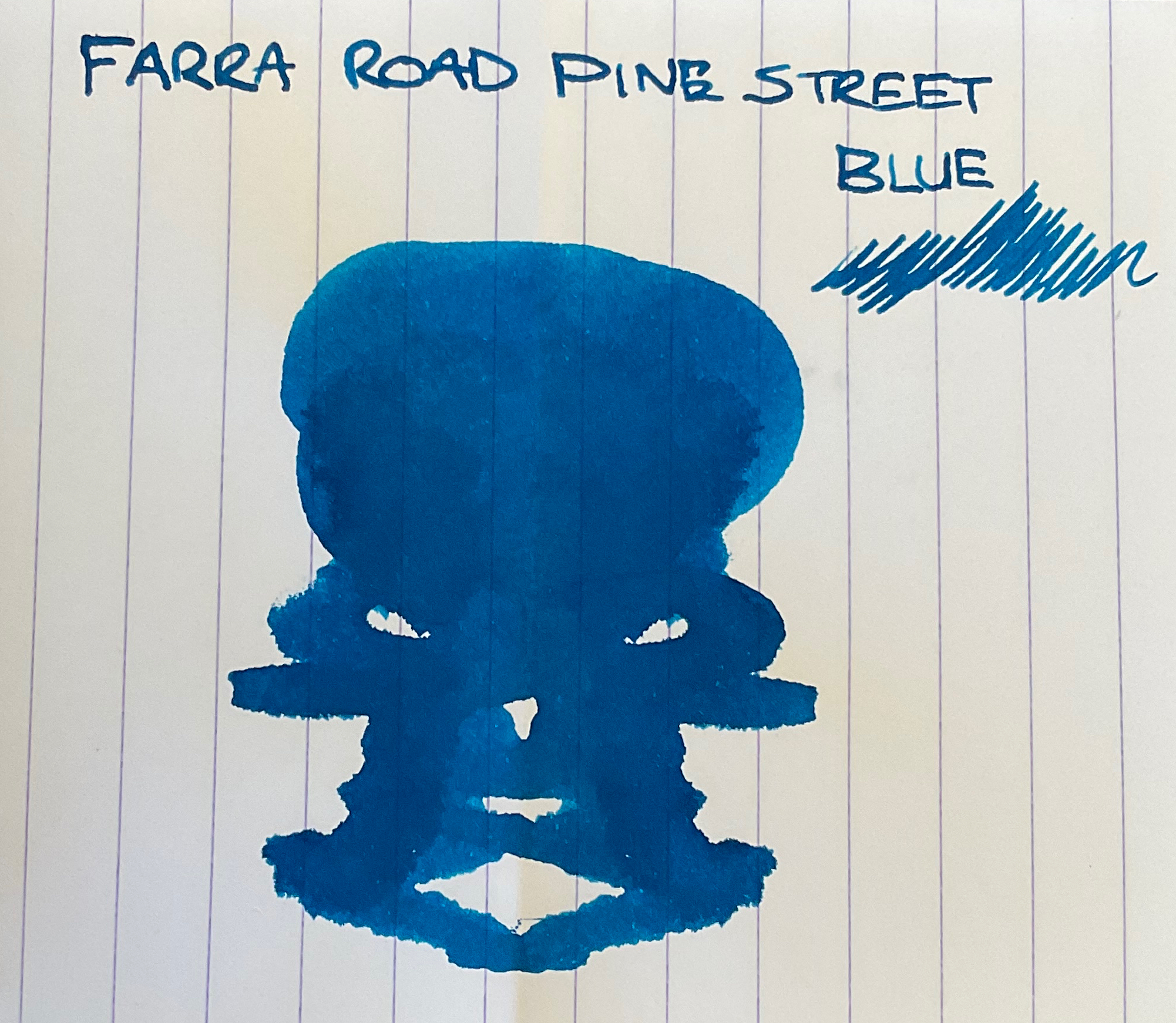
This is a bright saturated blue that reminds me of KWZ Sheen Machine – just without the sheen, or rather without such an extreme sheen. This shade of blue has more complexity and depth then your traditional blue, but still stays firmly in the blue category without leaning towards the purple or green spectrum. The shading on this ink is minimal, and I have only noticed sheen on endless paper – when the ink is fairly wet.
Frara Road Pine Street Blue – Endless Paper Doodle
Water resistance is not great, some sections remain visible – but anywhere the ink was not a dense it washes away. Cleaning this ink out is average for a saturated ink, it requires a few extra flushed then normal – but still better then Diamine Majestic blue in my opinion.
Frara Road Pine Street Blue – Full Review
Overall I think this is a perfect travel ink, the bottle is small, but sturdy enough to carry even in the smallest of bags, it seals exceptionally well, its dark enough for more formal settings but has enough depth that I won’t get bored of the colour quickly.
Frara Road Pine Street Blue – Top Half Review
I wouldn’t say this is a completely unique ink, as I own a few fairly similar colours – but this is a well behaved ink in the perfect ‘Try Me’ size. I’m hoping they come out with much more colours in the future.
Frara Road Pine Street Blue – Bottom Half Review
This ink was given to me as a gift, with no obligation/expectation or mention of a review. All opinions are my own and are in no way altered for promotional purposes. The links provided are not affiliate links, and I do not get any form of rumination should you chose to purchase from the link provided.
Frara Road Pine Street Blue Inkblot (Please ignore the incorrect spelling….)
Yasssss! Finally a shimmer mix! I’ve always wondered why the manufactures always stuck with either gold or silver shimmer exclusivly, I mean think about it – how stunning would a hot pink ink look with a blue shimmer? Or a seafoam with rose gold / copper shimmer? You know what would be a really great idea – shimmer ink chargers (dry shimmer pigment) that way you can turn any inks into a shimmer ink…
**UPDATE: Diamine’s Inkvent calendar has released a blue shimmer in a brown ink, and it looks epic.**
Endless Paper – J.Herbin 350 Vert Atlantide Doodle
Let me not get too carried away though and start with what’s actually happened – a shimmer ink that has both gold ANNND silver flecks of goodness. It’s brought to us by J.Herbin, and according to their Facebook its a Limited Edition. How true this will actually end up being I have no idea – limited editions somehow have a tendency to become permanent if they popular enough.
J.Herbin 350 Vert Atlantide Box FrontJ.Herbin 350 Vert Atlantide Box BackJ.Herbin 350 Vert Atlantide Box FrontJ.Herbin 350 Vert Atlantide Box and Bottle
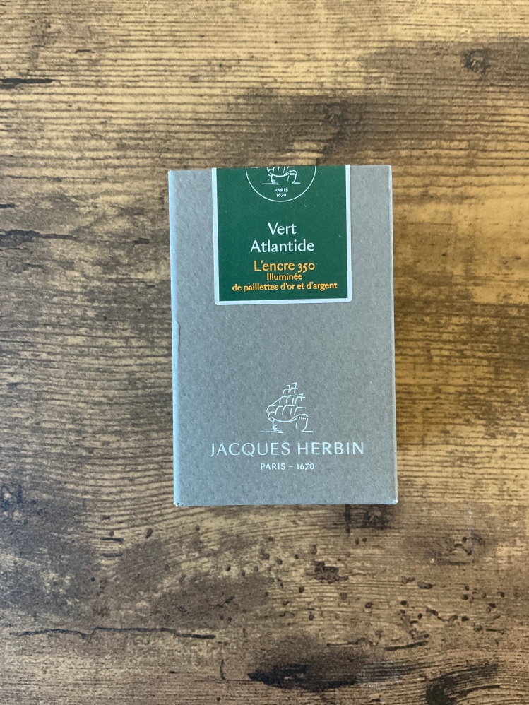
The ink comes in a modern grey box with the name and a coloured swatch section showing the colour inside. It comes in a glass inkwell style bottle, wax dipped cap and 350 wax seal stamp. The opening is large enough to fit large pens, which is an improvement from their original design. They’ve added a label in the front with the name, and approximate colour – should you be of the opinion that packaging is best when in the trash.
J.Herbin 350 Vert Atlantide Bottle FrontJ.Herbin 350 Vert Atlantide Bottle OpenJ.Herbin 350 Vert Atlantide Bottle BackJ.Herbin 350 Vert Atlantide Bottle UndersideJ.Herbin 350 Vert Atlantide Bottle Front Close
This colour was chosen by the ink loving community to celebrate the companies 350th anniversary. It a dark forest green which take inspiration from the lost city of Atlantis. Green isn’t my first though when thinking about Atlantis, but if you think of a lush island before its demise – its a perfect fit.
J.Herbin 350 Vert Atlantide Full Review
I tend to love colours that have more interest to them and this one does not disappoint. Its a toned down green that reminds me on pine needles. It shades from a midgreen to a very dark green, but then the shimmer settles – and because its a mixed shimmer, it ends up being this stunning soft gold champagne colour. Now I love shimmers in general, but this is the kind of colour that will be a regular in my daily pens.
J.Herbin 350 Vert Atlantide Review Top
This ink performs nicely – no feathering, and the only bleed-through is in extremely wet writing when using a flex pen. It has pretty good water resistance, and fair shading. As with most shimmer inks it requires a bit more work to clean out.
J.Herbin 350 Vert Atlantide Review Bottom
It is on the more expensive side, and if the shimmer doesn’t appeal to you then it’s probably not for you, but these kinds of colours that make me happy, so it’s 100% worth it for me.
***This ink is extremely hard to capture accurately on camera, neither my tablet nor phone could quite make the colours appear as they do in real life. The pink in the swatch, calligraphy and splotches is much more prominent then the pictures show. ***
Troublemaker Inks come in a squared off plastic bottle very similar to the plastic Diamine bottles. It has a cute sticker in the front and a very helpful circular label with the name and an approximate color swatch. If you would like a more detail on the packaging you can check out this post: https://stationeryramblings.wordpress.com/2021/09/15/troublemaker-inks-petrichor/
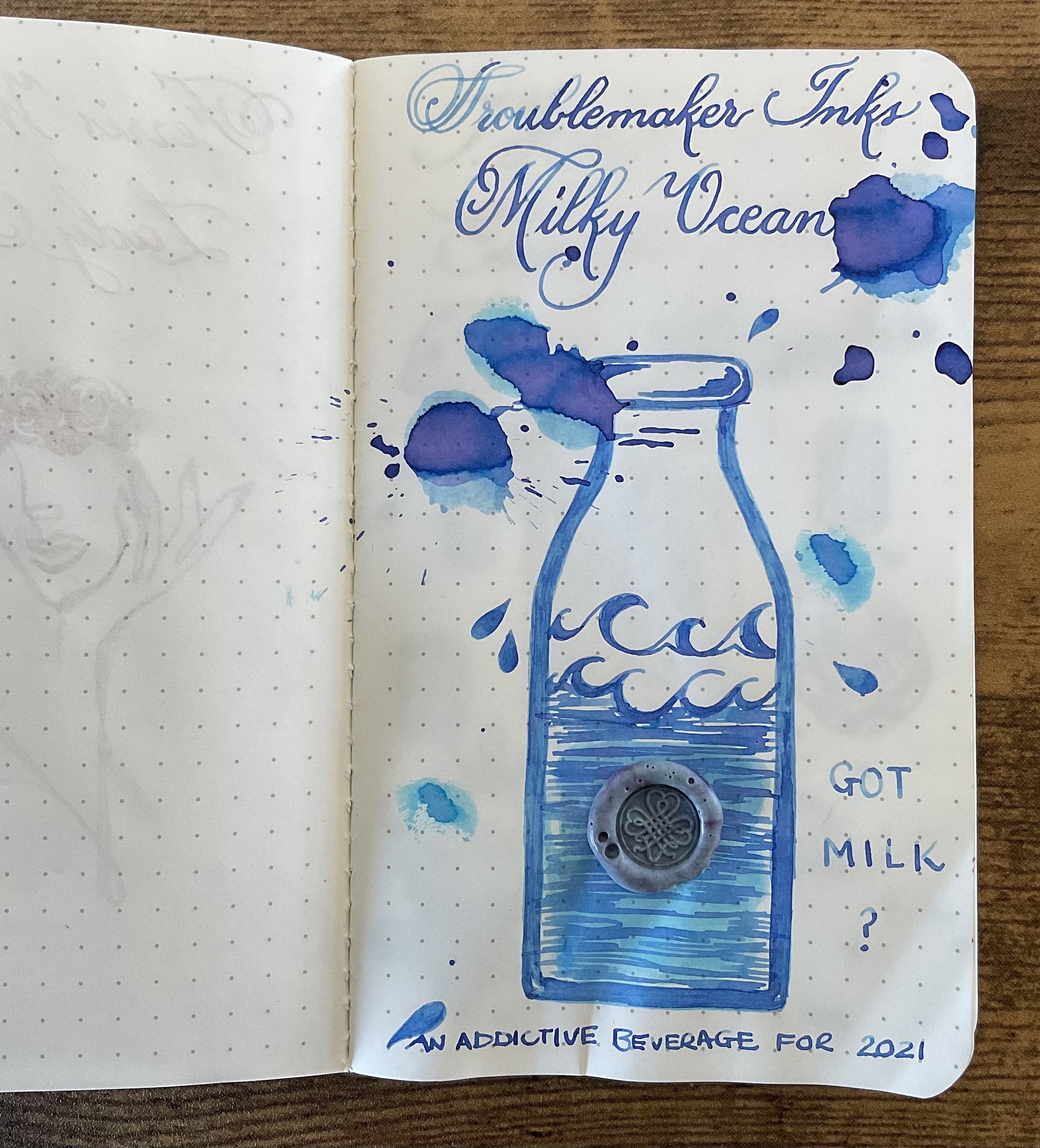
Trouble Maker Milky Ocean Box
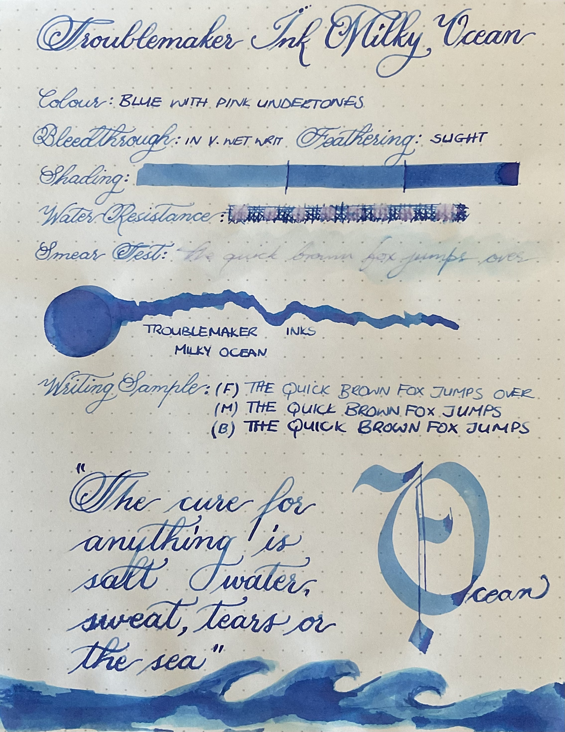
This inks name is so dreamy – and indeed the ink swab does have this beautiful dreamy cotton candy effect where it transitions from pink to blue with a bit of cyan and purple peaking through. Almost and ethereal quality that just so beautiful to look at.
Troublemaker Inks Milky Ocean Full Review
Weirdly enough this does not translate very well in normal writing on white paper, but the shading on this ink is excellent. This ink is more similar to your standard high shading inks, and while there is a dramatic colour shift – its from light blue to darker lavender blue not from a blue to pink that the swatch is famous for. When you use this more as an art ink, or a flat calligraphy nib, the colours really come out to play – and its beautiful!
Troublemaker Inks Milky Ocean Doodle
On the cream paper of my endless notebook, the pink is much more prominent, and even in normal writing you can catch a glimpse of the pink tones shining through. While I’m not sure if this is just because on Endless paper, the dry time is longer, so maybe the colour has more time to separate – I defiantly think this ink is complimented best by the cream paper. For both Abalone and Petrichor the opposite was true.
Troublemaker Inks Milky Ocean Review Top
This is marketed as a shading ink, and it excels at this – so if you looking for a shading blue ink, this one comes highly recommended. I did see some feathering and bleed-through but this was only in very wet writing.
Troublemaker Inks Milky Ocean Review Bottom
Water resistance is as expected, most of the colour washes away and only a faint ghost of the original text remains visible. Overall I have been very impressed with the trouble maker inks, with one of my favorite features being the colour shift aspect without any of the smudging that come with high sheen inks.
Troublemaker Inks Milky Ocean Compare
Troublemaker Inks Milky Ocean Compare
I don’t have a blue that really comes close to this colour in my collection, overall the troublemaker inks have been unique additions, with the colour shifts making them even more special and fun to use.
This ink comes in beautiful packaging – a white textured box with gold and teal foiling that displays images of mermaids, whales and tropical beaches… I don’t think the newer bottles have the same whimsical packaging though. Everything seems to have been updated to a standard more modern grey box.
J. Herbin 1670 Emerald of Chivor Box Back
J. Herbin 1670 Emerald of Chivor Box Side
J. Herbin 1670 Emerald of Chivor Box Side
J. Herbin 1670 Emerald of Chivor Box Design Front
J. Herbin 1670 Emerald of Chivor Box Design
The bottle is glass and beautifully designed, it features a wax dipped cap and a wax seal on the front which gives a lot of character and uniqueness to the overall design.
J. Herbin 1670 Emerald of Chivor Box Contents
The opening is small though, so filling a big pen could be a challenge – but I believe the size has been increased with the newer bottles. The wax on the cap also had a tendency to crack, but overall I think the packaging defiantly evokes the old school feeling of traditional ink wells and wax seals that were originally used to send letters.
J. Herbin 1670 Emerald of Chivor Glass Bottle
I have a love hate relationship with this ink. On the one hand, I love this colour – its a stunning dark teal with these beautiful flecks of gold and a red sheen that can sometimes appear as if by magic depending on the paper used.
J. Herbin 1670 Emerald of Chivor Glass Bottle Open
If the concentration of shimmer is high, it makes parts of the text look lime green, where the shimmer is more sparse it adds a beautiful dusting of dimension that isn’t immediately visible. (Unless you in sunlight obviously)
J. Herbin 1670 Emerald of Chivor Review Top
On the other hand, in my experience this is not a well behaved ink. In anything other then a fine/medium nib it tends to feather on me, and in all wet writing pens it bleeds through Rhodia.
I have the same issue with Diamine Snow Storm. I don’t know why some shimmers perform flawlessly, and others tend to feather and bleed even within the same brand.
J. Herbin 1670 Emerald of Chivor Review Bottom
My only guesses would be that if the ink contains a higher ratio of shimmer, then maybe the companies make the ink ‘thinner’ as to not block the feed? Or perhaps its just a characteristic of certain pigments?
J. Herbin 1670 Emerald of Chivor Full Review
The really nice thing about this ink is that even if you are using a medium/fine nib the shimmer still flows through easily and I have never had a pen completely block up on me, I’ve also never experienced a hard start. This is true for all my J.Herbin shimmers. On Endless paper the ink doesn’t feather, and only bleeds if the same spot is gone over continually. Endless paper is also where the beautiful red sheen come out to play.
J. Herbin 1670 Emerald of Chivor Endless Paper
As with all shimmer inks, I would recommend a pen that’s easy to clean out. Besides the shimmer, which always takes more effort to clean – this colour in itself requires more work to get clean. (Similar to Diamine Bilberry)
I this this company has the prettiest packaging I have ever seen for fountain pen ink. The box is beautifully foiled with dreamy images of the carnival and muted images that hint to the inks name, in this case roses.
Ferris Wheel Press Box Front
While I have known about Ferris Wheel Press Inks since the initial Kickstarter – and loved the packaging, I could never bring myself to purchase them because the colours were just so standard.
Ferris Wheel Press Box Back
Which feels like such a horrible thing to say, but that’s how I felt. For example Bluegrass velvet immediately made me think of Diamine Eau De Nil, Edwards Gardens of J Herbin Emeralds of Chivor, Candy Marsala of Diamine Oxblood/ R&K Morinda, Frivolous Lime of Diamine Kelly Green, Mirror Mirror Of Moraine or Diamine Soft Mint etc….
Ferris Wheel Press Box and Bottle Front
Now this is no hate on the brand, or even the ink colours themselves – and because I do not own any of these colours, I have no idea if they really are dupes in real life. That is just how I perceived many of the colours from the swatches I’ve seen. Don’t get me wrong, as the company started releasing more and more colours, I started creating a mini wish list of colours. These include the following:
Lady Rose** or Cream Of Earl (They just seem so similar in writing), Little Robina (Obsessed with this colour), Definitely Peachy (50/50), Madam Mulbery (50/50), Wonderland In Coral (Obsessed again)
**Superseded by Lady Rose in Gold
Ferris Wheel Press Box and Bottle Back
Lady Rose in Gold was no longer available, so I decided to go with the standard edition as my first colour from the brand. And the bottle is absolutely stunning, it has a very unique nut shaped cap, and beautiful gold foiling on the front of the bottle. On the back it had a solid colour sticker which I am guessing is supposed to represent the colour, along with the inks name. The bottle adds a touch of magic to my desk which makes me smile every time I look at it.
Ferris Wheel Press Box and Bottle Open
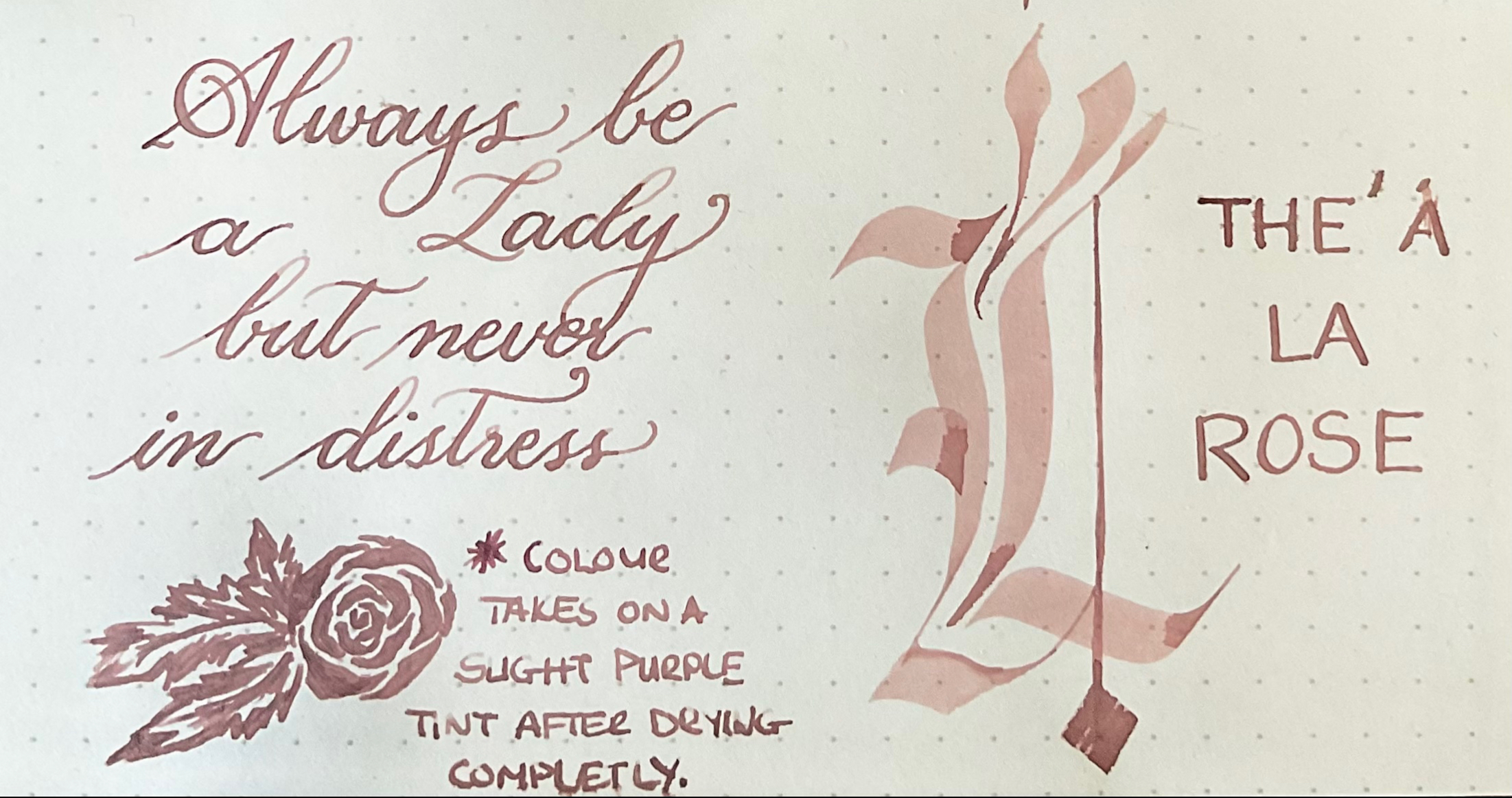
This ink is such a unique colour, very difficult to describe. It’s like a nude mauve dusky blush tone which changes slightly as it dries down – almost like iron gall inks. I have nothing even remotely close to this ink in my collection. It’s a colour that immediately makes me think of wedding tones. This is also a really difficult ink to capture accurately – it is a hint more pinky purple the the pictures show. The level of saturation is correct though.
Ferris Wheel Press Lady Rose Full Review
This ink behaves really well, no bleedthrough, no feathering and a decent amount of shading. The real shocker though is the water resistance – its excellent. On the smear test the colour barely lifted, and on the drop test the pinky nude tones disappeared, but the purple tone hasn’t budged. I was really expecting this colour to disappear completely.
Ferris Wheel Press Lady Rose Review Top
If there is a colour from this brand you love, the packaging is defiantly worth it, and the ink I tried behaves really well. It is an expensive ink though, so if it’s just the ink colour you after and don’t care about packaging, or are on a budget, maybe do a search first to see if there are a few dupes that may be better value.
* This is Noodlers original formulation of this colour. I believe the new one isdifferent in tone but due to a changes in pigments I’m not sure of the current shade.
If I had to venture a guess would say this would be a very popular seller for Noodler’s. The packaging as always is a simple white cardboard with the catfish on the box, the label on the other hand if very colourful and intricate. I feel like Nathan always puts easter eggs in his labels, but I’m not smart enough to figure them out.
Noodlers Ink Box Side ANoodlers Ink Box Side B
The bottles are always filled to the brim and they have a massive opening, the bottom is flat though so as with most bottles, it will reach a point where its just easier to decant it into a vial and fill it from there.
The best way to describe this colour is mulberry – as in the actual fruit. The shading goes from that almost ripe stage to almost black. It has that same purplish burgundy vibe and with very wet nib it even has a black sheen.
Noodlers Black Swan In Australian Roses Ink Bottle Closed
Oddly enough, I feel that this ink performs best in either a flex nib or a drier nib, because if the ink is laid on too wet the shading isn’t as pronounced.
Noodlers Black Swan In Australian Roses Ink Bottle Open
This is a well behaved ink with no bleed through besides the ink splat, and water resistance for this ink is exceptional. I do believe this is marketed as one of Noodlers water resistant inks, and it shows. The purple tone lifts a little, but the colour beneath remains virtually unchanged.
Noodlers Black Swan In Australian Roses Review Top
I don’t have any ink in my collection that is a perfect match for this colour, the closest I own would be either Diamine Grape which is lighter and more red toned, or J.Herbin Poussiere De Lune which is more of a blue based purple.
Noodlers Black Swan In Australian Roses Review Bottom
This ink is enjoyable to use in an office setting because it provides some nice colour and shading without being too bright and drawing to much attention. Another bonus is that because it is so waterproof it can actually be used for signatures, and cases where normal fountain pen ink would not be ideal.
Noodlers Black Swan In Australian Roses Review Full
I bought the Noodlers Konrad Demonstrator around 7 years ago from Goulet Pens. When I bought my original Konrad the acrylic ones were not available, and Noodlers was only being sold in America. The original demonstrator had / has? a super weird smell, it decolored to a brownish tint fairly quickly.
Noodlers Kondrad Coral Seal Box
So when the acrylic version showed up as “In Stock” at Write Gear I didn’t even think twice. I already knew I loved the way the Konrad handled, and even if the acrylic one still smelt funny – at least it would keep its beautiful colour. Below is a size comparison to the Lamy Safari and TWSBI ECO.
Noodlers Konrad vs Lamy Safari vs TWSBI Eco – Un-CappedNoodlers Konrad vs Lamy Safari vs TWSBI Eco – Capped
Noodlers has always maintained that they are an anti-waste company and the packaging reflects that. Its a plain white cardboard box with a black print – that’s it. The colour I purchased is coral sea and it is a beautiful mix of reds and blues with a pearly sheen. The ink window in the Konrad is very useful as this pen can eat up ink fairly quickly if it’s constantly being flexed.
Noodlers Konrad Coral Sea Box – All Angles
A caveat for anyone who doesn’t know much about Noodlers, this is a tinkers pen. It may work straight out of the box – it may not. In all cases, it it recommended to thoroughly clean the pen before inking to degrease it from any machining oils. In some cases it requires the feed to be heat set against the nib – I did this with my first Konrad to get the perfect flow. From the top: The Ahab, The Acrylic Konrad, The Original Konrad, The Nib Creaper.
Noodlers Konrad vs Noodlers Original Konrad vs Noodlers Ahab vs Noodlers Nib Creaper
I am completely obsessed with the pattern I received, I think I just sat and stared at the pen for 10 minutes straight. I honestly think I got the prettiest pattern of this pen I have ever seen. Its stunning, it has the perfect mix of red, blue and pearl is absolutely mesmerizing, there are even some translucent sections which give even more depth to the pen. The acrylic feels very high-end and has the same feel as my Edison pen. (This one being a much better deal)
Noodlers Konrad Coral Sea
This pen gave me issues though, please keep in mind I am not new to Noodler’s pens – So I understand that you need to tinker with each pen to get it to write, or for the ink to flow better. But this pen actually made me contact the store because I was positive my nib was faulty from the factory. The tines where so far apart, that the nib point no longer touched each other at the tip. I could fit a piece of Rhodia through the tines no problem. I did have to tinker a bit with all my other Noodler’s pens and heat set the feed to get the perfect flow – but it was minor tweaks and none of them had such a large gap.
Original Nib Close Up – Nib has since been replaced
But the large spacing on this nib constantly caused a disruption in the capillary action, the ink would flow, but not to the tip no matter how deep or high I put the feed.. Granted, I could have still tried heat setting the nib, and this may have very well fixed the issue, but if that didn’t work – I wouldn’t feel right about sending it back.
Noodlers Nibs Close Up – Left to Right: Noodlers Ahab, Noodlers Konrad Coral Sea, Noodlers Original Konrad.
Another thing I really struggled with was getting the plunger to move for the fist time and disassembling the filling mechanism – it was screwed in super tight. I honestly thought that if I twisted it any further it would break the mechanism, or even the acrylic itself – lucky this was not the case.
Konrad Disassembled
Being able to unscrew everything was very important to me because I love shimmer inks, and this is one of the best pens to clean out. You can literally just pull the feed and nib out, remove the filling mechanism and flush through the whole barrel with running water. I find this to be the second best feature after the flex nib – it makes life so much easier, especially when using inks that would normally require more extensive cleaning.
Noodlers Konrad Coral Sea – Partially disassembled
I’ve been very lucky with my Noodlers pens until now, but the above is something that you will see if you read multiple reviews of these pens. As long as you trust your retailer, and know they have good service, I would still recommend these pens 100%. Even if you do get one that needs to be exchanged, this pen is defiantly worth the effort.
In my case not only did Write Gear immediately promise to exchange the pen and arrange a collection, – they went the extra mile, and per my request allowed me to only exchange the nib and feed – because I loved the pattern of the original pen I received so much. I’m very grateful for this because I feel like I got the prettiest pen on the whole internets. Two days later, my nib arrived and my pen wrote and flexed flawlessly. (Again, not sponsored in any way shape or form. I honestly feel that they go above and beyond to make customers happy. I just happen to love the company and appreciate their contribution to the Fountain Pen Community in South Africa.)
Noodlers Konrad Coral Sea – Nib Closeup
The replacement nib worked perfectly with no heat setting required on my part. Below you can see how this pen compares in size and line variation to my Falcon and my other Noodler pens. The Konrad provides a much more comfortable and balanced feel compared to the Falcon and Nib Creaper which helps with the flex. This is not a 100% fair comparison because the Falcon is marketed as a “Soft” nib.
Noodlers Konrad Coral Sea vs Pilot Falcon
I partial to the Konrad because the Ahab is too bulky for me, and I fine the downward narrowing slope of the grip uncomfortable for my style of writing. I believe that the nips are identical, but the Ahab has a definite guiding notch for the nib, can take more ink and can be converted to an eyedropper. My Ahab nib is a bit scratchy, but since I almost never use the pen I haven’t bothered to sand it smooth.
Noodlers Coral Sea Back
Between the Demonstrator and Acrylic version I did notice some minor differences. The first being that there seams to be tiny notch in the acrylics grip section, but not enough to be a definite guide – so perhaps a not machined smoothly? The second is that there is no possible way for me to push the nib and feed down as deep as my original, the inside section is narrower. Lastly, it seems that they have added a metal support to the piston twist mechanism and the length between the two pens is different. Please keep in mind that my Konrad is one of the early releases, and this may no longer be the case.
NB: The below writing sample is done with the replacement nib Write Gear sent me.
Noodlers Flex pens and Falcon compare
Is this pen worth it? Defiantly, it’s one of my favorite pens – and If I had to pick one pen for the rest of my life from my collection it would be this one. The versatility and practicality bundled into this pen is extremely well thought out. From the ink window, line variation and the ability to easily assemble/disassemble the pen makes it an excellent all rounder.
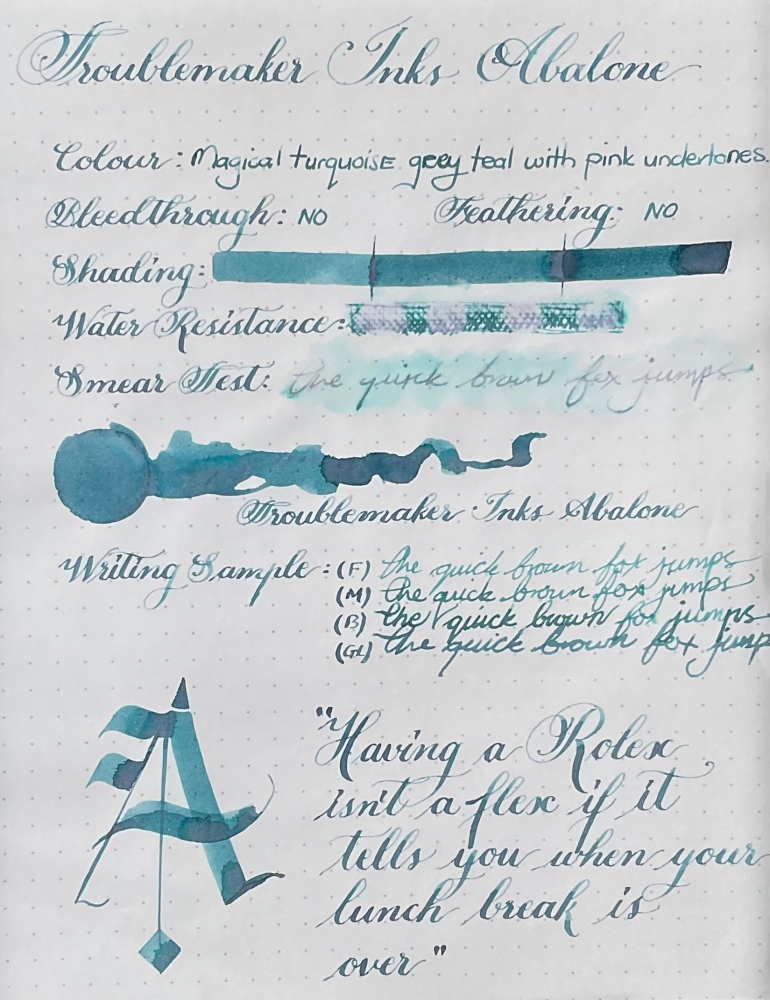
Troublemaker Shading Ink colours have really impressed me, this is the second ink in the range that I am trying and I’m already planning to add more. They have this unique ability to give colours more character. I love love love this colour, did I say love enough? It’s a midtoned green blue slightly teal colour, with this beautiful dusty pinky purple that splits out while creating a darker border around it. It is an absolutely stunning colour with a lot of depth to it, and really does draw you in. It reminds me of the ocean with the different play of colours – I think this ink will make a fantastic art ink. This colour was exceptionally difficult to capture with my phones camera.
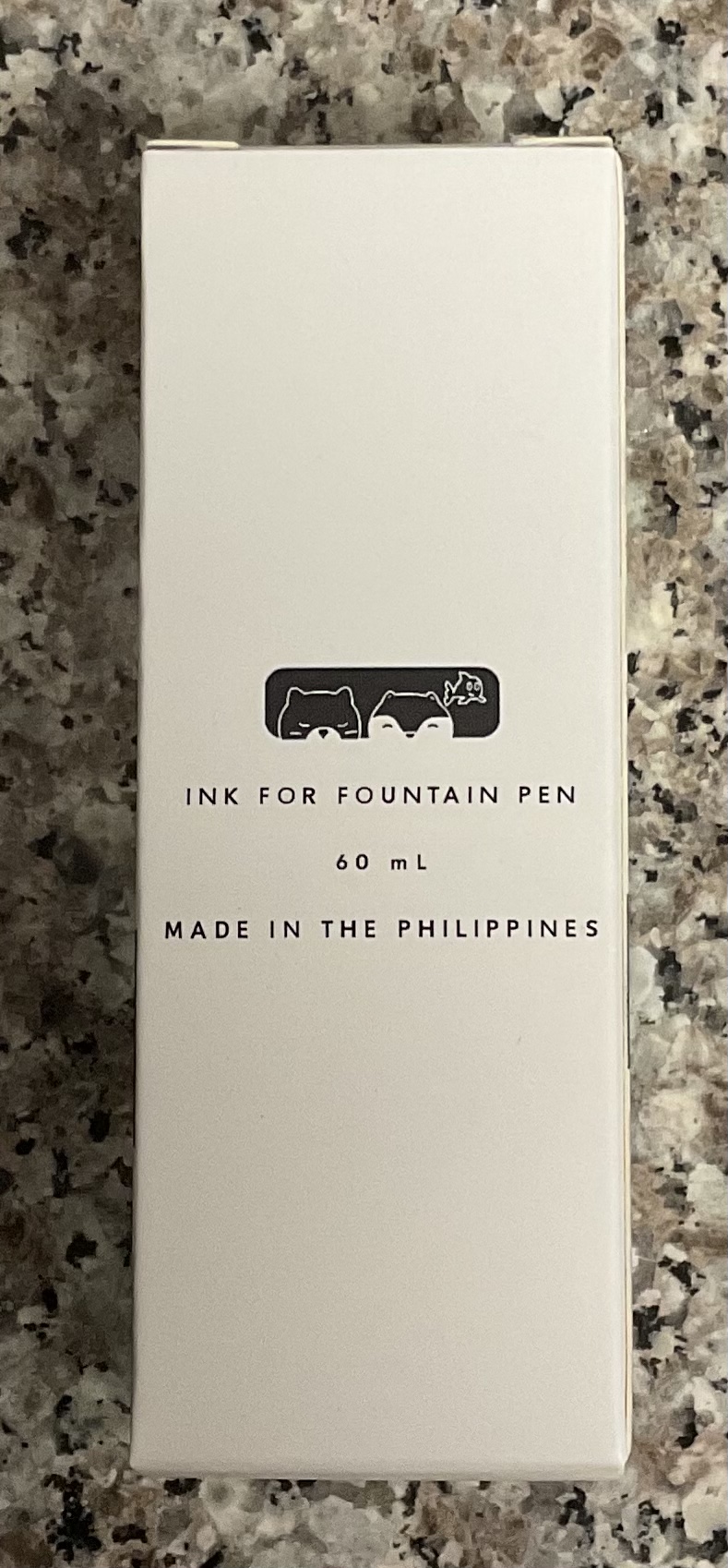
Troublemaker Inks are an artisanal ink studio in the Philippines and as with Petrichor, this is a very well behaved ink. No bleedthrough even in very wet writing – but the ink drop did had a few dots that come through. This ink gives both a dreamy feel but can also feel moody, which just enhances it even further. Its a weird thing to say right – that the ink gives a feeling? But then again, all my favorite inks seem to do that – it’s not just about being a pretty colour.
The colour shift is not caused by a sheen, which is how many of my other inks get there colour shift, because of this I get zero smudging, zero. This just makes me love the ink even more, because inks that smear and smudge long after they’ve dried drive me a tad crazy.
The box has a clean and simple feeling, similar in size to the plastic diamine bottles with a decent sized openeing. Once again I wish the bottle were glass, but it is what it is. If you would like a more detailed view of the packaging – I have the Petrichor post linked. https://stationeryramblings.wordpress.com/2021/09/15/troublemaker-inks-petrichor/
I have nothing that really compares to this ink in my collection. You do need a broader, wetter nib for the ink to have more character, but even in a medium nib the shading is there. The water resistance is also surprisingly good, the blue tones disappear, but the writing underneath is still perfectly legible.
The one thing I have noticed (for both inks) is that white paper gives the best effect with these inks. The cream colour of Endless paper tends to mute the colour, the shading is still great – but the colourshift becomes much less visible and more typical. Rhodia/white paper is defiantly the way to go with this ink.
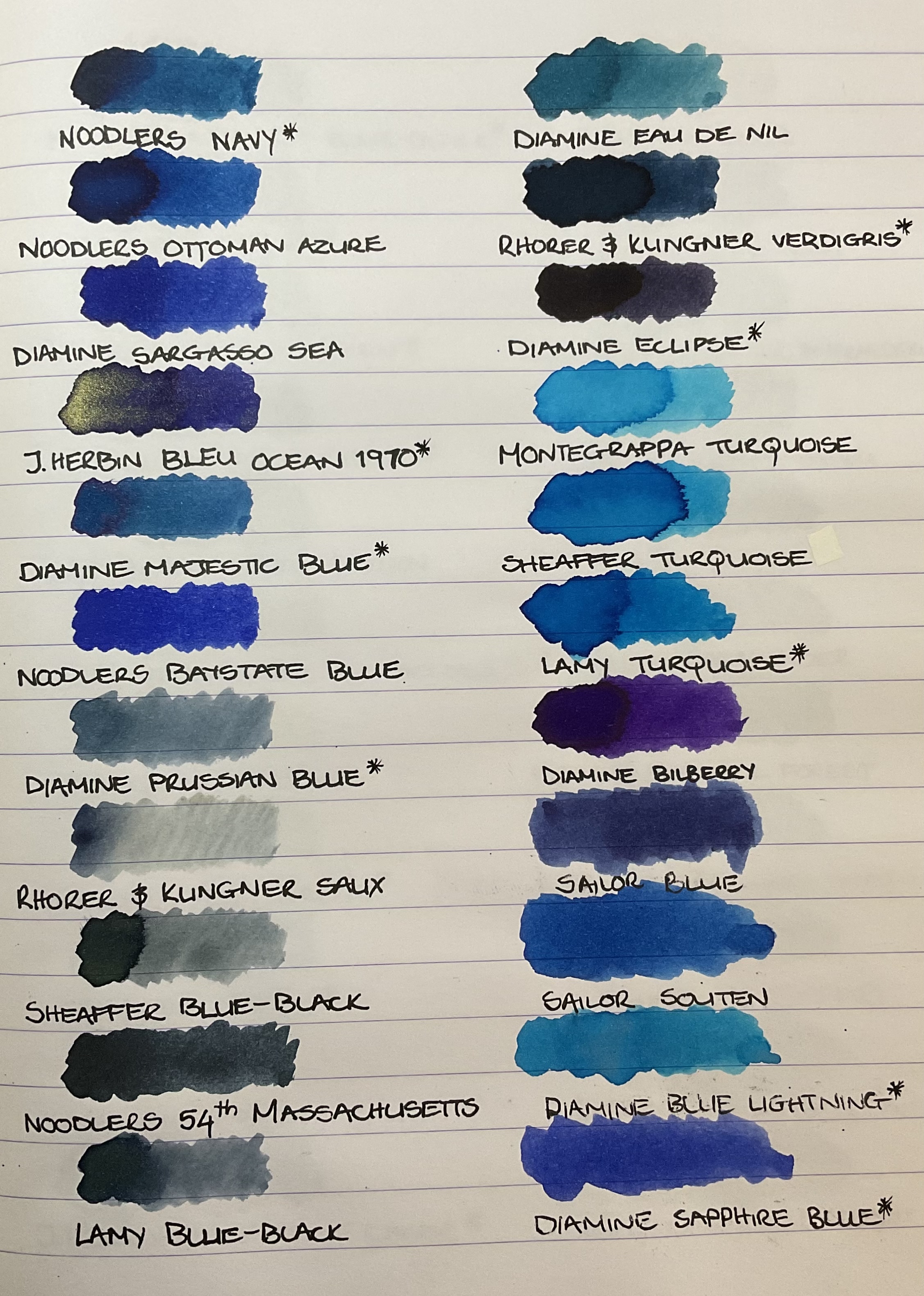
As with all these types of inks, actual writing with a fountain pen vs the more artistic applications will determine how dramatic the colourshift is. Below you can see swatches of all the blue inks in my collection, and none of them are a good dupe for this colour.
Its no secret that I have a love for shimmer inks, and my favorite are the ones are the ones that give a muted or neutral colour a bit of something something.
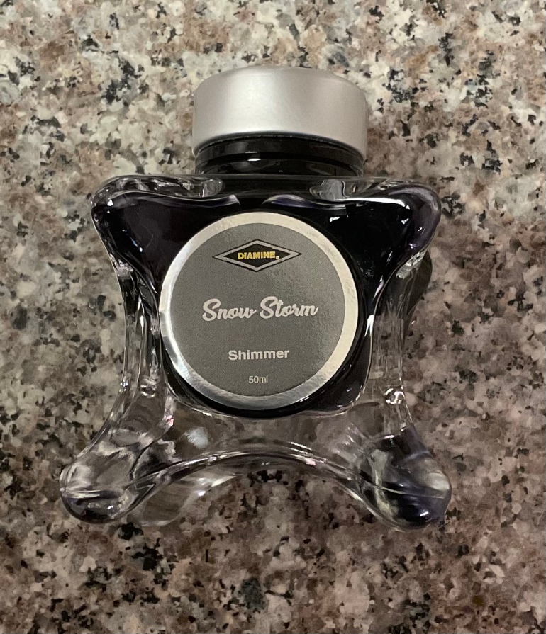
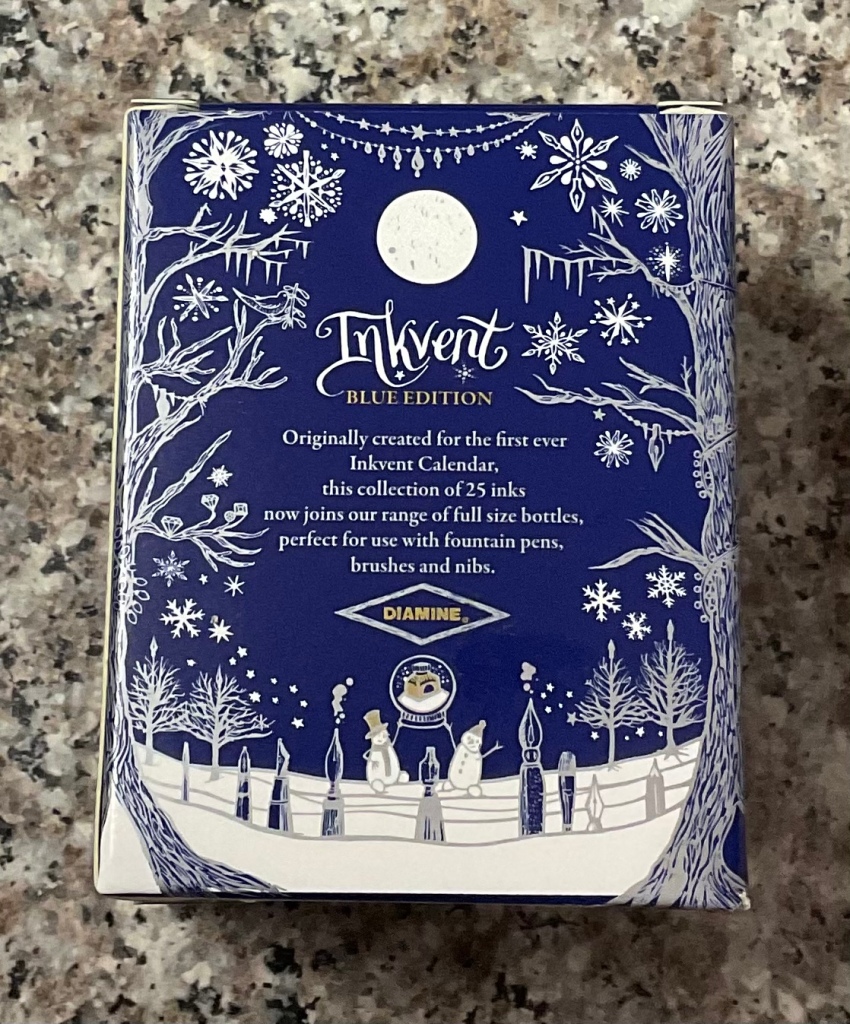
Diamine Snow Storm Box Top
For example, stormy grey by J.Herbin is one of my all time favorite inks, and in my regular rotation because of its muted black base. Colours that are already loud and bright, which then have shimmer added feel more of a specific case scenario, then a weekly rotation choice. (That being said I’m very excited about the promo pictures of Ferris Wheel Wonderland Coral – that looks like its going to be such a unique addition to my shimmer collection.)
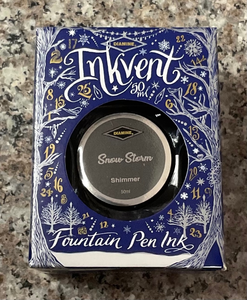
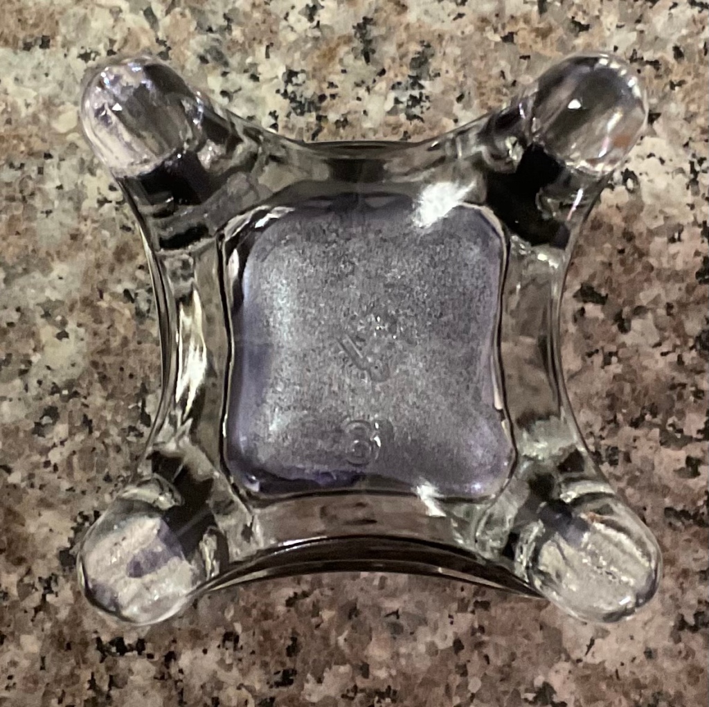
The bottle comes in a silver and gold illustrated box done by the talented Sarah J Coleman, with a round cutout showcasing the inks name. The bottle on the other hand is beyond weird. Is it a star? A snowflake? I have absolutely no idea. I lacks the elegance of Iroshizuku inks, or even classic styling of standard sized diamine bottles, but it has a wide enough opening to make filling a pen easy, and its defiantly unique.
Diamine Snow Storm Bottle and Box
The fact that they not the easiest inks to clean out, and the colours are largely repetitive – I can see why a large portion of the fountain pen community find them a novelty and nothing more.
I think the cleaning is completely worth the beauty, which is why when I saw the Diamine Inkvent Blue Edition Snow Storm was back in stock my initial cart was promptly re-arranged.
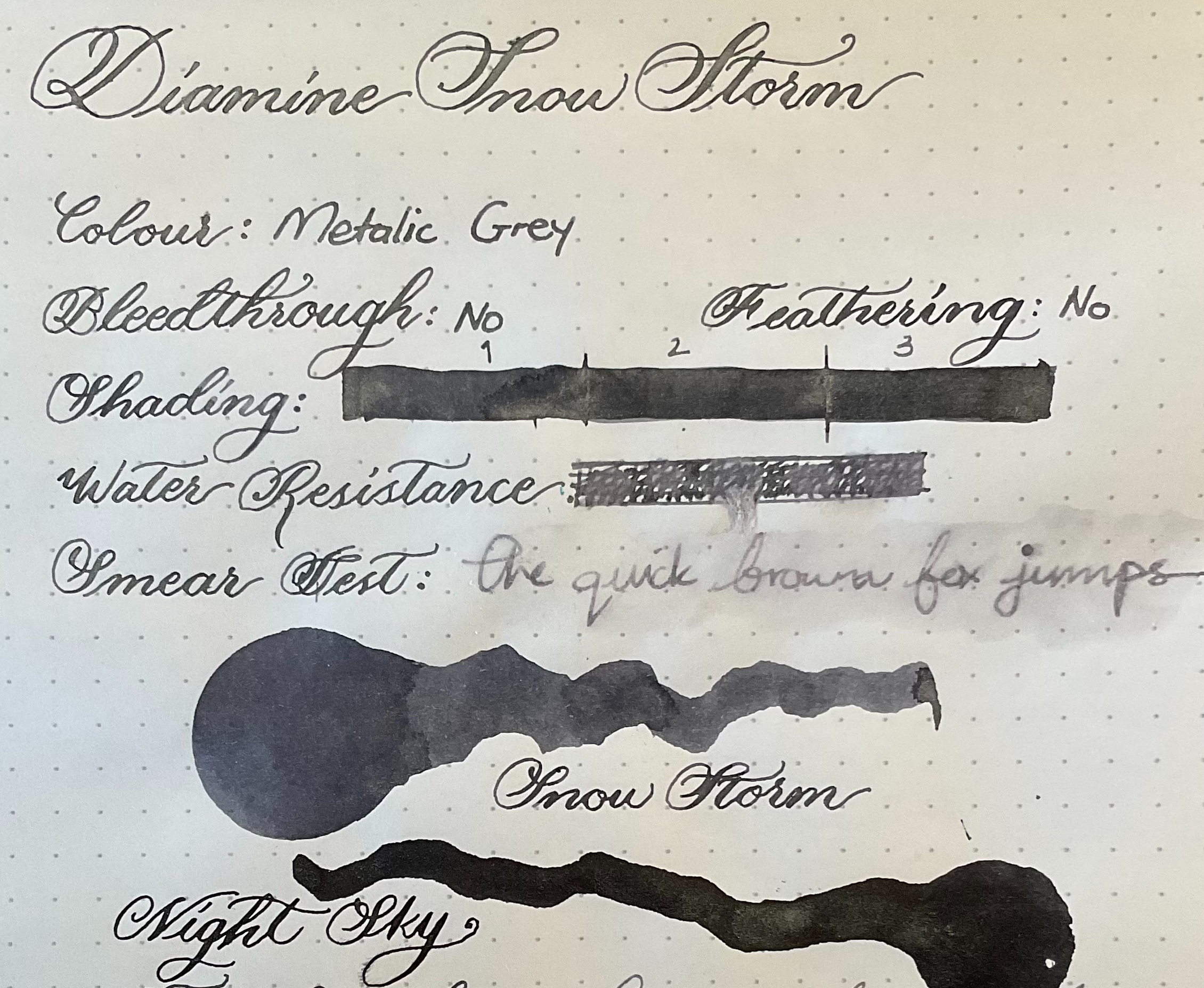
The base colour of the ink is a slightly blue toned grey colour, with super fine silver shimmer particles wich seem to be much smaller then I’m used to. I don’t know if its just an optical illusion because the shimmer blends right into the colour, or if they really did make the shimmer smaller for this range.
Diamine Snow Storm Full Review Shade
Honestly this is not the colour I was expecting. From online swatches I was anticipating a light purplish grey, but this colour is more of a mid-toned slightly cool grey.
Overall this is the most muted shimmer ink I own and only really stands out if light hits it. This ink almost gives me metallic gel pen vibe which is not something I ever expected, or even though was possible with fountain pen ink.
Diamine Snow Storm Full Review Sunshine
It’s a lovely ink, but Stormy Grey by J.Herbin is still the one to beat. As with all shimmer inks it required a bit more work to clean out, but since I always use these inks with pens where the nib can just be pulled out and flushed out, this doesn’t really bother me. Surprisingly the water resistance on this ink is quite good.
Diamine Snow Storm Review Top
With very wet writing (Pilot Parallel & Calligraphy Dip Pen) it tends to feather quite a bit along with some bleed-through – this also happens when going over the same spot multiple times. Besides the dimensional shimmer this is a fairly flat ink with minimal shading appearing only when writing in block letters.
Diamine Snow Storm Review Bottom
The colour is very similar to Diamine Night Sky, but with a grey base instead of black – If I had to venture a guess I would say Diamine Moon Dust would be almost identical to this ink. It is one of the more unique shimmers I own though, due to the gel pen effect.
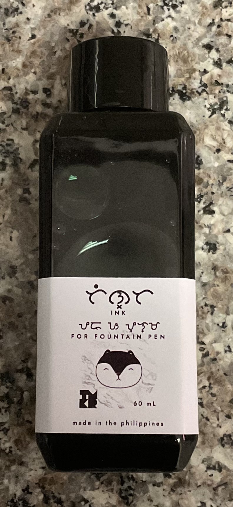
There really isn’t much information about troublemaker inks on their website other then they are an artisanal ink studio in the Philippines. I first read about them on Fountain Pen Network, and they immediately reminded me of the Sailor Ink Studio 123 which I’ve been wanting to try, so hence my shopping spree…
Trouble Maker Inks, Petrichor Box
The colour I’m reviewing today is called Petrichor, which is actually a term coined by Australian scientists for the smell of rain hitting dry soil. I didn’t even know there was a word for this, and I can 100% say that if I had known that, I would have probably bought this ink just the ink for its name alone.
The packaging is simplistic but beautiful, the gradient sticker on the box with the cute animation and pattered sides gives the box a youthful sophisticated feel.
Troublemaker Inks, Petrichor Bottle Front
The bottle is a rectangular plastic bottle very similar to the Diamine 30ml bottles. I wish these bottles were made of glass because its not the cheapest ink, and a slight knock would send it everywhere. I do understand the practicality of it though as glass would add considerably to the shipping costs.
Troublemaker Inks, Petrichor Bottle Top
The opening is big enough to comfortably fit most pens, although as with the diamine bottles it gets more difficult at about the halfway mark.
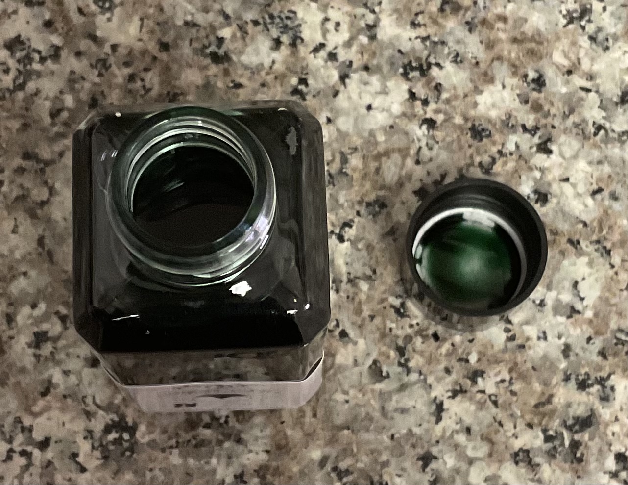
Troublemaker Inks, Petrichor Bottle Open
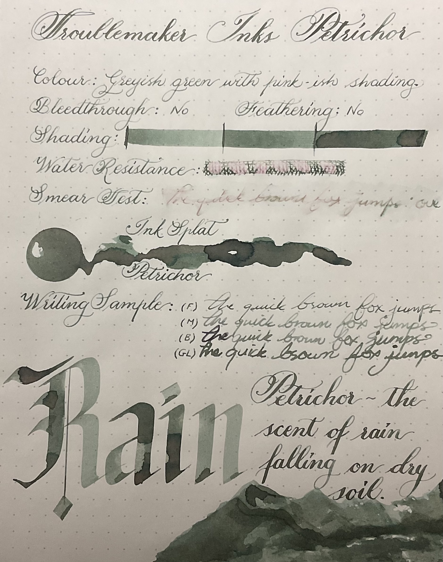
The ink itself is defiantly a chameleon. In thin or dry writing it appears as a mid-tone greenish grey, but with wetter writing it appears pinkish grey. In even wetter writing the pink is further accentuated and a stunning green border appears.
Troublemaker Petrichor Ink Review Full Page
This ink is slightly on the drier side, but exceptionally well behaved. Even with heavy ink on the paper, and multiple layers it barely bleed though, and nothing on the page below it. I don’t foresee this ink bleeding through with any kind of normal writing even if the pen is a wet noodle.
Rhodia, Back of the Page
The water resistance is better then I expected, but although the pink portion of the ink stays on the page its not very legible. It is easy to wash out, and the best part about this ink besides the colour is that it does not smear. Smearing inks are a pet peeve of mine, so whenever I use an ink that has such unique shift in colour – but doesn’t smudge it makes me very happy.
Rain Shading Up Close
Troublemaker Inks Petrichor Ink Splat
The ink seamlessly blends from colour to colour switching between muted pinks and intense greys all in one ink splat. If I had to pick a single colour category for this ink I would choose grey, but its so much more then that. I honestly have nothing like this colour in my collection. The shading is excellent even in fine nibs, but I would defiantly recommend a broader wet nib to get the best pinkish green effect.
Troublemaker Inks Petrichor Top Page Review
This is an incredibly difficult ink to capture because of all the subtleties in colour and it defiantly looks better in person. If you like greenish moss greys and oyster pinks, you’ll love Petrichor, but if blues and baby pinks are more your thing – get Abalone instead. (That is of course if you only want one….)
Troublemaker Ink Review Bottom
On Endless Paper, with a very wet nip the pink in this ink becomes more peachy, giving this ink yet another colour variation. With a fine nib the pink almost completely disappears, this is probably due to the fact that the paper is more cream then white.