Diamine Sherwood Green

Yaaaas, this ink is everything I wanted Lamy Peridot to be! Is a beautiful forest green, which takes on a black border in wet writing. It shades from a mid-tone green to a lovely deep colour and is a solid performer. I have a 30ml bottle of this ink, which honestly, I think is the perfect size for an ink that is not constantly being used.

Diamine Sherwood Green 30ml Bottle

The Diamine 30ml bottles are made from plastic and are essentially small rectangles with a fairly wide opening in relation to the bottle size.

Diamine Sherwood Green 30ml Bottle Top View

I find it easy to fill my pens, even the slightly chunky ones – but it does need to be held securely while filling as it does not have the glass weight to prevent it from toppling over.

Diamine Sherwood Green 30ml Bottle Open

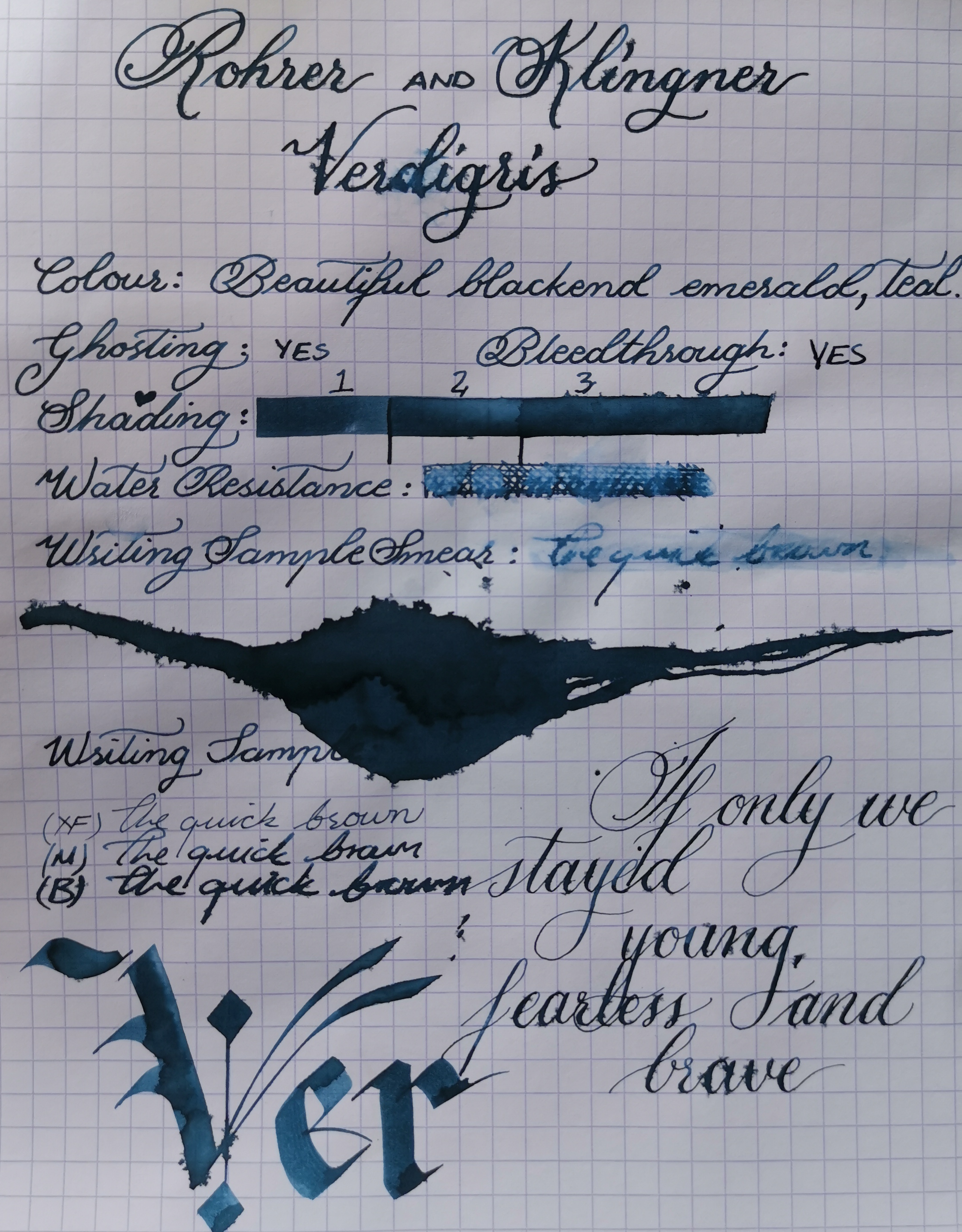
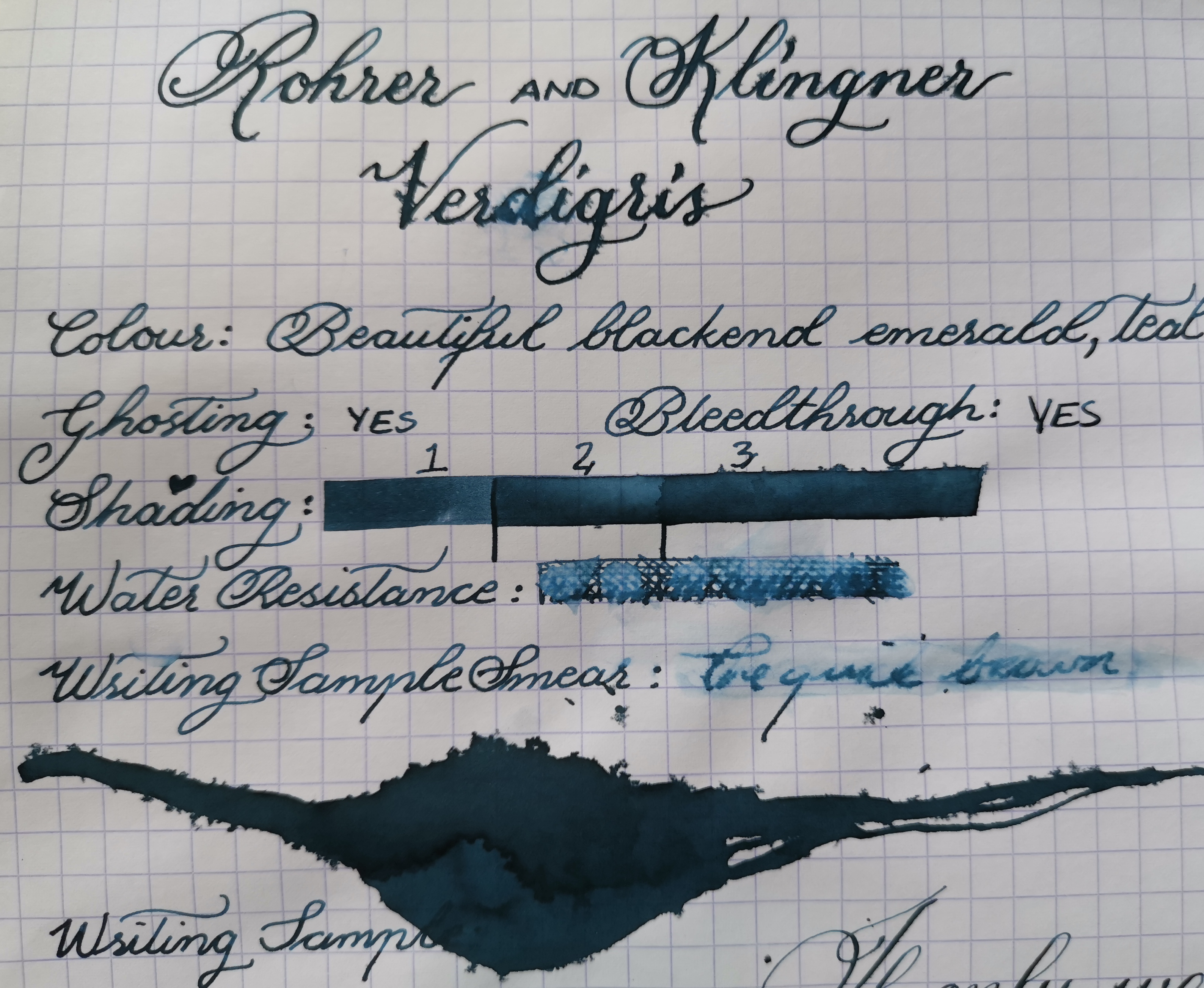
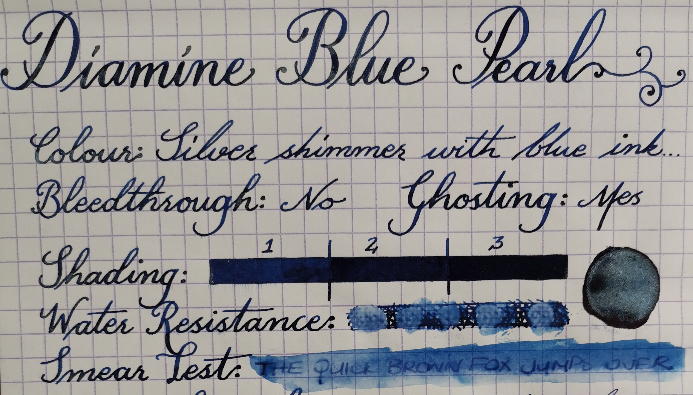
This is a great performing ink with no feathering or bleedthrough even when using a dip calligraphy pen. I did get some beedthrough spots in the ink splat, but even then it was tiny.

Diamine Sherwood Green Ink Full Page Review

This ink has subtle shading, with a black sheen that sometime appears in the borders of the letters – which I love. It reminds me of the magical forests with fairies and gnomes, but still has a bit of an edge. I love the fact that even though the colour itself is a pretty standard green, it’s a colour that has dimension.

Diamine Sherwood Green Ink Review Close Up Top Half

I find it to be dark enough for office use, and washed out of my pens fairly easily. If you spill something and immediately wipe it the water resistance is actually pretty good, but any form of extended contact and the ink is pretty much Bye Felicia.

Diamine Sherwood Green Ink Review Close Up Bottom Half

The closest comparisons in my collection would be Mont Blanc Irish Green. Diamine Tropical Green is more vibrant, while Diamine Magical Forest is brighter, as well as being a shimmer formula.

All in all this is actually one of my favorite greens in my collection and is a beautifully performing ink. As always this ink can be purchased at the link below.

Diamine Sherwood Green – Write Gear: https://writegear.co.za/product/diamine-ink-sherwood-green/

PS: Not sponsored, just honestly the best company for fountain pen stuff that I’m aware of in S.A.

M.

TWSBI Eco Clear/Demonstrator

Okay, so for the last year-ish? my TWSBI 580 Diamond has been bust. I have no idea what happened, on day it was my daily writer – the next the feed was broken in half. No other damage, no cracks on the lid, body or cap, no bent nib nada. Feed from the middle of the barrel just broke in half.

I looked for a spare part, but they not availabe in South Africa, and buying the part from the States (thanks to shipping) is just not worth it. So I kinda gave up on it for a while. I tried to love another pen, after all I have like 12 others – but after a few days, I was missing my TWSBI again. There was just something about the 580 that made me love it. The way the nib glided even though it was an EF, the beautiful facets, the plastic that always looked crystal clear, the cap that’s so perfect the nib never ever ever ever gave me a hard start… To me this pen was magic, until it wasn’t.

Now I bought the TWSBI GO a while back, and I mean it’s a good pen – it writes well, filling it takes a few seconds at most, and cleaning it is a breeze… but it has a childish feel to it, a fun pen, but not a daily write for me.

TWSBI Box Bubble Wrap

So I debated for a really long time as to what I should do. Should I just get the exact same pen again? Do I go for a different colour? Maybe try a different mechanism like the VAC? Try the mini perhaps? Another thing I was also debating was price. A pen had never broken on me before, the most damage I’ve ever done to a pen was spring a Noodlers flex nib – and here was a pen that outwardly was still in pretty perfect condition (bar a few scratches) but was now essentially useless to me, do I risk the same thing happening?

TWSBI Box
TWSBI Box

I finally made up my mind that it would be the ECO demonstrator which had entered the market. The plain ECO not the ECO T, which comes with assisted grip guidelines very similar to the Lamy Safari. It wasn’t as beautiful, but it was still pretty and almost all the reviews said it was the best value for money – and wrote almost exactly like the 580. And since it was cheaper if it broke again I wouldn’t be as SadMad – so I went for it.

TWSBI Sleeve and Box Front
TWSBI Sleeve and Box Back

The box design is extremely minimal, and gets straight to the point. Simple cardboard sleeve, plastic container, plastic wrench, manual, silicon gel, pen. Done.

TWSBI Box Contents
TWSBI Box Contents

Its a good sized pen and I’m very comfortable using it unposted. The pen does post should you required it and the O ring at the back grips the pen quite securely. Its comfortable to hold, and you can see the size comparison to a bic pen.

TWSBI ECO Posted compared to BIC Pen
TWSBI ECO compared to BIC Pen

I noticed that the pen wrote dry straight out of the box, but once left overnight it wrote beautifully and has never felt dry since. So I think this was just a matter of the feed needing time to “absorb” the ink into all its groves. Even though I have been using it since April, mostly with dark inks the plastic is still crystal clear. Now this is really good pen that has become my semi regular pen, but I still find myself missing the Diamond 580 – and wishing I had repurchased that one instead.

Inky Goodness
Inky Goodness

The cap has a bright red top embossed with the TWSBI logo, and also has a pretty cool feature where because it has flat facets the pen never ever rolls off the table. Wherever you put it, that’s where it stays. It has the same filling mechanism as the Diamond 580, which does make it a little bit more time consuming to clean – but it holds a really good amount of ink and this pen can be taken apart if you so wish.

TWSBI ECO Cap Closeup
TWSBI ECO Section and Cap Closeup

So this pen falls into a weird limbo space for me. Now that I own it – I think its to similar to the 580 to justify purchasing the 580, but still find myself wishing that it was the Diamond 580. At the same time, I know 100% that if I didn’t own it – I probably would not repurchase it, instead I would have re-bought my original or tried the VAC. Again this is a really really really good pen – but there was just something about the Diamond 580 that turned it into MY daily pen without me even realizing it.

TWSBI ECO Box Contents

If you on a budget and looking for a great pen, with the added bonus of being a demonstrator – this pen is great. I can’t knock it in any way other then its simply missing the magic of the Diamond 580 for me personally. And also keep in mind I have never tried the TWSBI VAC – so maybe that ones even better. All I can say is that from the TWSBI range I have tried, if you on a budget skip the GO and buy the ECO its a fantastic all rounder.

TWSBI ECO Close up
TWSBI ECO Close up

I cannot reiterate this enough, the ECO is a fantastic pen – it’s just doesn’t fell like “MY” pen.

As always this product can be found at Write Gear: https://writegear.co.za/page/1/?s=TWSBI+eco&post_type=product

M.

Rohrer & Klingner Verdigris

Now this is a blue I can get behind. Its dark and mysterious with a deep ocean vibe. I love this colour –  I’m pretty sure it falls under the blue-black umbrella but I would say this colour is more blackened-emerald-teal-navy. There is a depth to this colour that is difficult to capture. In bright light it looks teal, in others black, with a more yellow light it has more of a green tint, think of it as an ocean in a bottle. Not the surface of the ocean, but below the ocean surface when the light starts to to fade and you get that beautiful gradient effect going into the depths.

Verdigris Full Page Review

Verdigris Full Page Review

The downside of this colour is its feathering and bleeding, it is a beautifully behaved ink in anything from a dryish broad under – but if your broad writes wet or you use a dip pen, be prepared.

Verdigris Half Page Close Up

Verdigris Half Page Close Up

Now the colour for me it totally worth it, and since my preference in pens tends to run on the fine side, with a (M) nib for this ink is the sweet spot between shading and performance. But if you enjoy broad and wet pens, this ink may not be the best option.

Close Up Colour and Shading

Close Up Colour and Shading

The water resistance is slightly above average, and clean out does take a few extra flushes. The bottle as with all Rohrer & Klingner inks has a wide opening making filling pens a breeze.

Close Up Bottom Half

Close Up Bottom Half

I would suggest getting a sample if this ink first to determine if the formula works with your pen and paper preferences, but it’s defiantly a favorite colour of mine from their range.

Close Up Ink Splat

Close Up Ink Splat

As always, you can find this ink here: Rohrer & Klingner Verdigris

M.

Diamine Blue Pearl

Apparently I’ve been in a shimmer mood this month, all my pens in rotation are currently inked up with one of Diamine’s Shimertastic inks.

Diamine Full Page Review

Diamine Full Page Review

Now I tend to rave about J.Herbin Stormy Grey and it is slightly better then Diamine Sparkling Shadows in my opinion; but Diamine Blue Pearl trumps J Herbin Bleu Ocean by a mile. The shimmers are different colours with Bleu Ocean getting a gold, while Blue Pearl has a silver shimmer.

Blue Pearl Ink Splat

Blue Pearl Ink Splat

But Blue Pearl just has a magical quality to it, the shading that goes from a midtone blue to navy, with a black sheen that gets filled with pools of silver shimmer… magical I tell you.

Close Up 6mm Nib

Close Up 6mm Nib

This ink, like all shimmer inks needs to be shaken well before use to suspend the silver particles, and the best way to keep the shimmer evenly distributed is to keep turning the pen while in use.

Diamine Pearl Blue Top Page

Diamine Pearl Blue Top Page

This is one of the few blues I truly enjoy using for extended periods of time, and is defiantly a firm favorite from the Diamine Shimmer line.

Water resistance on this ink, is slightly better then most, and since this is a shimmer ink, it does require some more effort to clean out. That being said, I used my Lamy Safari and the feed pulls right out, so if you have a pen that allows you to do that – It defiantly makes clean up pretty quick.

Diamine Pearl Blue Bottom Page

Diamine Pearl Blue Bottom Page

There are a few blues that come close to the base colour, but the pools of silver shimmer and black sheen is what really set this ink apart, even if its not in direct sunshine.

This ink also has a really good price point, has no bleedthrough or feathering on Rhodia paper and performs well in all the pens I’ve tried. Win Win.

Shimmer Shift Blue Pearl

Shimmer Shift Blue Pearl

As always, this ink can be found at Write Gear

M

Diamine Red Lustre

So I had a bit of an accident prone week and this happened… (Insert face palm here) It’s terrible because  I only had a sample and I murdered it… Also I’m being a tad dramatic.

Ink Spill

Ink Spill

Ink Spill 2

Ink Spill 2

This week I’ve been using a shimmer ink from the Diamine Shimmertastic ink line called Red Lustre. Its a muted dark red with gold sparkle. The first thing that came to mind was J.Herbin Rouge Hematite – but this is more of a muted tone with no sheen.

Full Page Tilt No Shimmer

Full Page Tilt Almost No Shimmer

I only have a sample of think ink, but I would think that the bottles have the same narrow opening as previous versions. This ink, like all shimmer inks needs to be shaken well before use to suspend the gold particles, and the best way to keep the shimmer evenly distributed is to keep turning the pen while in use.

Full Page Tilt All Shimmer

Full Page Tilt All Shimmer

I would say the base colour of this ink seems to be Diamine Monaco Red, and although I don’t know if that is indeed the case, if someone asked me for a non-shimmer version on this ink that would defiantly be my recommendation.

Top Half Ink Review

Top Half Ink Review

Water resistance on this ink, as with most fountain pen inks is not great, and since this is a shimmer ink, it does require some more effort to clean out. That being said, I used my Lamy Safari and the feed pulls right out, so if you have a pen that allows you to do that – It defiantly makes clean up pretty quick.

Top Half Ink Review

Top Half Ink Review

This ink can go from a very intense gold colour to a muted red depending on the amount of shimmer particles and quantity of ink laid down, creating a beautiful effect. I do still prefer J Herbin Rouge Hematite purely because I prefer the base colour. But this ink writes beautifully has lots of sparkle, no bleed through and at the price point, is hard to beat.

Close Up Shimmer Shot

Close Up Shimmer Shot

Another bonus of the Diamine inks is that they already have a range of primary colours, so technically you could invest in a Red, Yellow and Blue and mix any shimmer colour you’d like.

Fire is the test of gold

Fire is the test of gold

Below you can see how this ink compares to other reds in my collection. This is done in a Clairefontaine notebook.

Red Swatch Party

Red Swatch Party

As always, this ink can be found at Write Gear

In other news did you hear Tomoe River paper has arrived in S.A!

M

Sailor Souten

Those of you who have been reading my blog post for a while know if not a huge fan of blue inks. Not because I dislike blue, simply because I find most blue inks to be, for the most part redundant. Now there  are a few blue inks I love, but I find most of them lacking in uniqueness. So many blue inks, but very few special ones imo.

Sailor Souten Doodle

Sailor Souten Doodle

That being said, even though the colour may not be on my personal wish list I cannot fault this ink at all. You know that feeling of a hot knife gliding through butter? Well thats how Sailor inks feel in my nib. If I could only use one ink formula for the rest of time, it would defiantly be theirs.

Sailot Souten Review

Sailot Souten Review

I only purchased a sample because again (blue) but I would describe the colour as a midtoned blue with a subtle red sheen. The closest comparision I can think of would be Diamine Majestic Blue, but this ink doesn’t smudge as easily.

Closeup ink swabs front

Closeup ink swabs front

Closeup ink swabs back

Closeup ink swabs back

This ink has almost minimal shading in normal writing, but has a beautiful red black sheen  and some shading when using a broader nib, but as with most inks its not visible in EF / F nibs.

Close Up Sailor Souten

Close Up Sailor Souten

The formula of this ink is good with no feathering, ghosting or bleedthrough. It cleans out easily and has semi decent waterproofness. I did struggle to capture this inks colour 100%, as in some light is appear as a darker blue, and other times appears much lighter. I would say the most accurate colour would be between the two ink splashes.

Broad Nib and Wash

Broad Nib and Wash

I highly recommend Sailor inks, and if this is a colour that you enjoy you can check availability and pricing below:

Write Gear

M

Iroshizuku Yama-Budo

Oh wow! Can you believe its already August? I know right, seems the older I get the faster time seems to go by.  People who say their 30’s are amazing need to tell me how its done, because i’d jump back to basic arithmetic and three month holidays in a heartbeat. Enough about my old age, lets jump to the ink at hand.

Ink Box

Iroshizuku Ink Box

The Iroshizuku line is a premium fountain pen ink created by Pilot, and in my opinion they’ve done an excellent job. According to Pilot they chose the name Iroshizuku because its a combination of the Japanese words “iro” (colouring) expressing high standards and variation of colours, and “shizuku” (droplet), which embodies the very image of dripping water. Each ink name derives from the expressions of beautiful Japanese natural landscapes and plants, all of which contribute to the depth of each individual hue. In this case the name Yama-Budo is translated to Crimson Glory Vine.

Yama Budo Bottle

Yama Budo Bottle

The box it comes in feels expensive and the bottle is pure simplistic elegance, the only other thing in the box is a simple pamphlet.

Yama Budo Open

Yama Budo Open

The bottle is beautiful and has a large opening as well as a handy functional dip, that should allow you to get the very last drop out.

Full Page Writing

Full Page Writing

Now this was an exceptionally difficult colour for me to try and capture, it has a chameleon quality depending on the lighting. My definition of this colour would be a darkened magenta. Its neither pink, red nor purple but more like a mixture of all the above. The colour is reminiscent of red wine, when is spilled on a white carpet.

This ink handles and flows like a charm, and with standard fountain pens this ink performs flawlessly. I really think pilot did a great job with this line. I did get some bleedthrough, and feathering but only when using an exceptionally fine calligraphy nib. Once I switched to a smoother larger one – the problem was no more.

Extra Fine Calligraphy Nib

Extra Fine Calligraphy Nib

Normal Sized Copperplate Nib

Normal Sized Copperplate Nib

The pilot parallel gave me no problems whatsoever, and demonstrated the range of shading this ink can accomplish. The water resistance in this ink is pretty good, with cleaning still remaining relatively easy.

6mm Nib

6mm Nib

The closest colour comparison would be Rhorer and Klingner Magenta, closely followed by Noodlers Cactus Fruit Eel which is the same range, but a brighter slightly more pink tone.

Colour Compare

Colour Compare

From the two Iroshizuku inks I own,  and from the inks that I own, only Sailors ink formula beats it for me. The inks write smooth without hard starts, clean out easily and

As always this ink can be found online at Write Gear  and for those of you lucky enough to live in the mother city, why not stop at the physical store and see the perrrrdy for yourselves?

M

TWSBI GO

I’m a tad late on this review, so lets jump straight in shall we?

The TWSBI GO is packaged so beautifully and simplistically, it would feel quite comfortable sitting on a shelf in the apple store.

TwsbiGoPackaging

TwsbiGoPackaging

 The simple cardboard sleeve only has the TWSBI logo printed on the front, and houses a slimline plastic case with the TWSBI name debossed into the plastic.

TwsbiGoPackaging

TwsbiGoPackaging

 The plastic case has a sticker seal on each side, and once opened the pen is displayed dead center. The only other item in the box is a small instruction leaflet.

TwsbiGoPackaging

TwsbiGoPackaging

TwsbiGoPackaging

TwsbiGoPackaging

I don’t consider the TWSBI GO a beauty, my first thought when I held it in my hand was “I feel like a two year old”. Like when you see a young child’s hand clutching a crayon that looks giant in their tiny hands.

It.is.a.FAT.pen – at least for me.

Bic vs TWSBI Go

Bic vs TWSBI Go capped

Bic vs Go posted

Bic vs Go posted

I compared the TWSBI GO to a Bic pen, and the Kaweco Sport since most people own a Bic, and the Kaweco is a popular pocket pen.

Kaweco Vs Go

Kaweco unposted Vs Go unposted

Kaweco Vs Go

Kaweco posted Vs Go unposted

Kaweco Vs Go

Kaweco Vs Go – both posted

Another thing i’m not that excited about is the plastic that the pen is made from, this gets a solid “Eh” from me. This is the basic run of the mill plastic shell, with an even cheaper looking plastic grip section. But for the price it’s to be expected, and they did add some good details to the cap.

Cap Detail

Cap Detail

Go Cap Detail

Go Cap Detail

That being said, I adore the fill mechanism – its exceptionally quick to fill and incredibly easy to clean out. While the pens looks may not be my favorite, the fill mechanism defiantly is.

TWSBI Go dismantled

TWSBI Go dismantled

The plastic is translucent which means you can see both the fill mechanism, as well as your ink level – a very useful thing to see, especially since I chose the 1.1mm stub.

The grip section has a very similar triangular grip to the Lamy Safari, and although I know this may bother some people I find it very comfortable.

TWSBI GO Nib and Grip

TWSBI GO Nib and Grip

The cap is a click on/off cap with a lanyard loop and a seal inside to prevent your nib from trying out.  Love the seal, love the click cap, but am very confused about the lanyard loop. Who here has ever went out and actually bought a lanyard for themselves? I have one, because it was being given away at a expo – I have never actually used it though – and I doubt I ever will.

Lanyard loop

Lanyard loop

Lastly the nib, and it is good. I inked it up with J.Herbin Emeralds Of Chivor. And just look at it! Looks! It writes with the same quality as my Diamond 580, is smooth with no hard starts, beautiful flow and I honestly can’t fault it at all.

1.1mm stub

1.1mm stub

So all in all would i recommend this pen? I would say depends on your budget and what you already own.

Already own a TWSBI 580 (or any other TWSBI twist piston mechanism)?:

* Get the Twsbi GO. The fill mechanism is fun and quick to  use, and brings a different more relaxed fountain pen experience. (IMO)

Don’t own a TWSBI at all?:

* Get the Eco – from the reviews I’ve seen and recommendations I have heard – I would
say rather save the extra and go for that one. It has a much classier look and I feel without the price tag of the Diamond 580. (Again IMO)

It’s a fun pen which is destined to the land of shimmer inks and calligraphy pages, and i’m
pretty sure its gonna love it there.

Emeralds Of Chivor

Emeralds Of Chivor

You can get your TWSBI pen here: Write Gear

Which TWSBI is your favorite?

M

Kaweco Sport – White and Gold

I must say, I’ve been wanting a Kaweco Sport for a while now, but I specifically wanted a BB nib. And the specific combo I wanted wasn’t available so I waited.

Kaweco Sport Cap Detail

Now in general anything from a M up just doesn’t do it for me with regards to everyday writing, so why the very abnormal obsession with BB?

Kaweco Sport Capped

Well, my favorite ink of all time is J Herbin Stormy Grey. And yes, it works perfectly fine in a M or B but I really like creating page patterns with this ink. A BB nib will fill it out the coloured areas quickly, and is the only standard sold nib size missing from my current collection. Also I had this idea in my head of the perfect ink, pen, nib and pocket journal combo.

Writing Sample

So I present to you the most perfectly matchy travel combo of all time: The white and gold Kaweco Sport, with a BB nib, filled with JHerbin Stormy Grey used with the TWSBI A6 pocket journal.

Kaweco Sport and TWSBI A6 notebook

But back to the pen. I got my pen at Hobby-X expo in Joburg, my main reason for going was that Write Gear decided to do a pop up stand. This was my chance to drool over all the perddddy, and finally get my hands on that elusive BB nib.

Now I must apologize, the pen packaging got into an altercation with an apparently “empty” cup of coffee… unfortunately the coffee won. So I don’t have a photo available, but the pen comes in a basic black slimline box with white Kaweco prints all over it. The pen is simply wrapped in a protective plastic wrap that has a sticker with a barcode.

The pen itself comes assembled with a single blue cartridge inside. Now my initial plan was to turn this pen into a drop filler, but once I got home I realized my O rings were to big for the actual pen. I just went ahead, used some silicone grease and filled it anyway, but getting a mini converter just seems safer.

The design of the pen is modern an classic at the same time, while the octagonal cap provides an anti-roll function which I find very useful.

Kaweco Sport VS Bic

The pen is travel friendly when closed, but posts to a comfortable almost full sized pen. This nib does give me a few hard starts and skips, but as a disclaimer, I did purchase the only BB nib that was available and it happened to be a demo nib at the show. Also the fact that i’m using a shimmer ink probably doesn’t help. Other then that it writes like butter, its amazing.

The other thing I regret not getting is the clip attachment. I honestly thought it would be more in the way then anything else, but walking around, it would be much more convenient if I just clipped it onto my notebook.

Kaweco Sport VS Bic

All in all I’m very happy with this pen, and it will be my official shimmer ink pen going forward. My TWSBI Diamond 580 is still my favorite everyday pen by far, but as an affordable travel pen – this is highly recommended.

Lastly I just want to give a big thank you to Write Gear, I know I defiantly was not their easiest customer, so thank you for being so accommodating. Meeting you guys, was amazing and getting
to see all the stock was defiantly the highlight of the expo.

Write Gear Booth

As always this pen, but not this nib can be found at Write Gear

Word of the day:

Brobdingnagian


M.

Diamine 1864 Blue Black

Wow, just wow…over a year since my last post – that’s a record. Shout-out to the reader who reminded me I actually have inks that need reviewing! Hopefully the annual break won’t be repeated.

Does anyone even read blog post anymore? With youTube so readily available, and Instagram being a mini film mecca, the moving pictures of  Hogwarts seem to have become a reality. Nonetheless, ponderings for a different day > to the ink!

Diamine 1864 Blue Black was part of an anniversary collection released to celebrate Diamines 150th year, the bottle is one of 8 wedge shapes that come together forming a perfect circle.  I did not purchase the bottle, as my love of blue and black inks tends to be very limited. But it defiantly is the most blue-black, blue black ink I have tried.

Diamine 1864 Blue Black

Diamine 1864 Blue Black

The colour reminds me of something James Bond would use to sign a document. Formal enough to be accepted on any legal document, but on closer inspection, not all is as it seems. Although that may not be the best idea, because any water would make the inked document null and void.

Diamine1864 Blue Black

Diamine1864 Blue Black

I would describe the colour as Navy Black, and uniquely enough, the wetter/broader the pen – the more navy the colour appears.

Diamine 1864 Blue Black

Diamine 1864 Blue Black

This ink did not feather or bleed through in normal writing, but when using the Pilot parallel I did notice feathering. As this is fairly rare on Rhodia Paper, i’m guessing this may not be an ink that fares well on standard pad and copier paper.

Below are a few ink drop comparisons, and I stand by my statement – a lot of blue-black inks that I try immediately get classified as navy blue in my head, this one really does have me asking the question… Is it blue or black?

Diamine 1864 Blue Black

Diamine 1864 Blue Black

As  always, this ink can be purchased at Write Gear

Pens: Lamy Safari, Flex Dip Pen, Pilot Parallel 6mm

Paper: Rhodia Grid Pad

Word Of the Day: Verisimilitude

Shameless Plug: Instagram

M.