
I this this company has the prettiest packaging I have ever seen for fountain pen ink. The box is beautifully foiled with dreamy images of the carnival and muted images that hint to the inks name, in this case roses.

While I have known about Ferris Wheel Press Inks since the initial Kickstarter – and loved the packaging, I could never bring myself to purchase them because the colours were just so standard.

Which feels like such a horrible thing to say, but that’s how I felt. For example Bluegrass velvet immediately made me think of Diamine Eau De Nil, Edwards Gardens of J Herbin Emeralds of Chivor, Candy Marsala of Diamine Oxblood/ R&K Morinda, Frivolous Lime of Diamine Kelly Green, Mirror Mirror Of Moraine or Diamine Soft Mint etc….

Now this is no hate on the brand, or even the ink colours themselves – and because I do not own any of these colours, I have no idea if they really are dupes in real life. That is just how I perceived many of the colours from the swatches I’ve seen. Don’t get me wrong, as the company started releasing more and more colours, I started creating a mini wish list of colours. These include the following:
Lady Rose** or Cream Of Earl (They just seem so similar in writing), Little Robina (Obsessed with this colour), Definitely Peachy (50/50), Madam Mulbery (50/50), Wonderland In Coral (Obsessed again)
**Superseded by Lady Rose in Gold

Lady Rose in Gold was no longer available, so I decided to go with the standard edition as my first colour from the brand. And the bottle is absolutely stunning, it has a very unique nut shaped cap, and beautiful gold foiling on the front of the bottle. On the back it had a solid colour sticker which I am guessing is supposed to represent the colour, along with the inks name. The bottle adds a touch of magic to my desk which makes me smile every time I look at it.

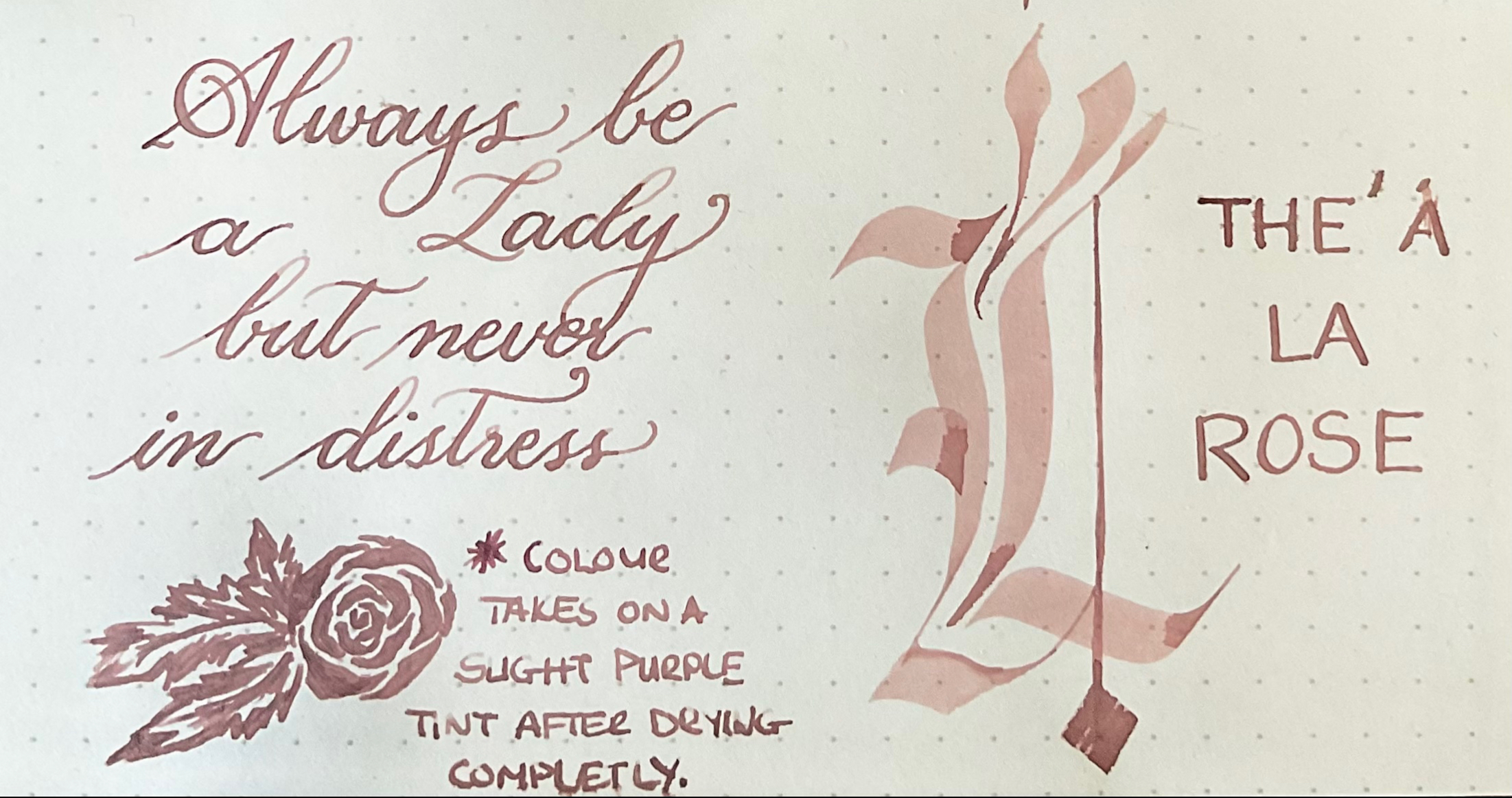
This ink is such a unique colour, very difficult to describe. It’s like a nude mauve dusky blush tone which changes slightly as it dries down – almost like iron gall inks. I have nothing even remotely close to this ink in my collection. It’s a colour that immediately makes me think of wedding tones. This is also a really difficult ink to capture accurately – it is a hint more pinky purple the the pictures show. The level of saturation is correct though.

This ink behaves really well, no bleedthrough, no feathering and a decent amount of shading. The real shocker though is the water resistance – its excellent. On the smear test the colour barely lifted, and on the drop test the pinky nude tones disappeared, but the purple tone hasn’t budged. I was really expecting this colour to disappear completely.

If there is a colour from this brand you love, the packaging is defiantly worth it, and the ink I tried behaves really well. It is an expensive ink though, so if it’s just the ink colour you after and don’t care about packaging, or are on a budget, maybe do a search first to see if there are a few dupes that may be better value.
M.
