
There really isn’t much information about troublemaker inks on their website other then they are an artisanal ink studio in the Philippines. I first read about them on Fountain Pen Network, and they immediately reminded me of the Sailor Ink Studio 123 which I’ve been wanting to try, so hence my shopping spree…

The colour I’m reviewing today is called Petrichor, which is actually a term coined by Australian scientists for the smell of rain hitting dry soil. I didn’t even know there was a word for this, and I can 100% say that if I had known that, I would have probably bought this ink just the ink for its name alone.
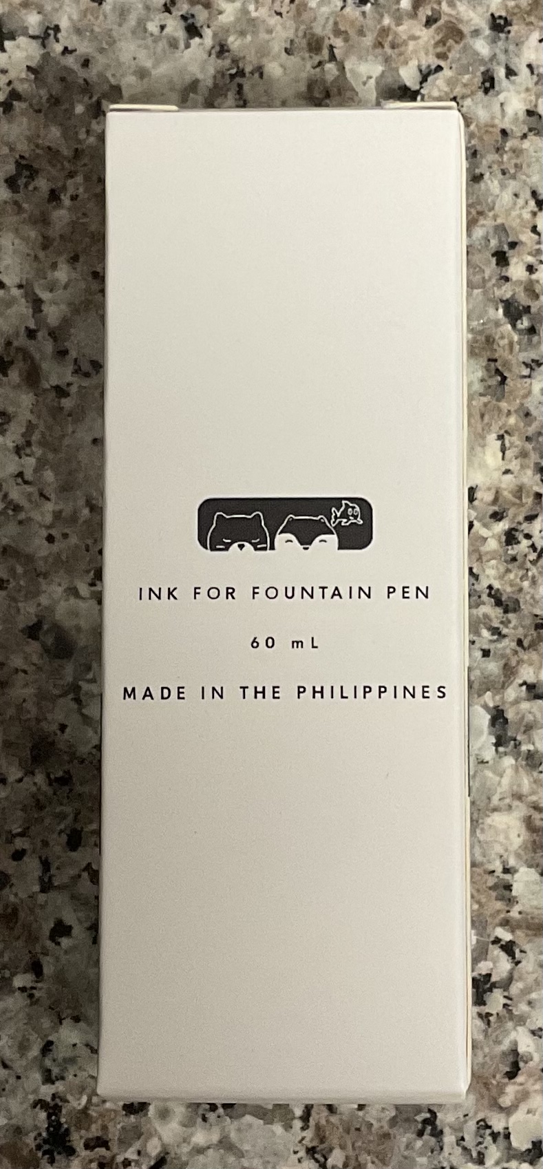

The packaging is simplistic but beautiful, the gradient sticker on the box with the cute animation and pattered sides gives the box a youthful sophisticated feel.
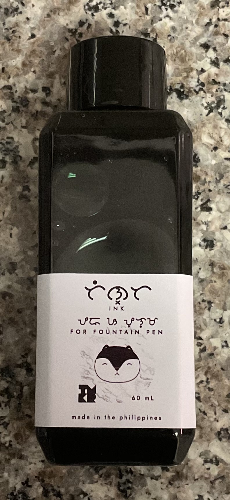
The bottle is a rectangular plastic bottle very similar to the Diamine 30ml bottles. I wish these bottles were made of glass because its not the cheapest ink, and a slight knock would send it everywhere. I do understand the practicality of it though as glass would add considerably to the shipping costs.

The opening is big enough to comfortably fit most pens, although as with the diamine bottles it gets more difficult at about the halfway mark.
The ink itself is defiantly a chameleon. In thin or dry writing it appears as a mid-tone greenish grey, but with wetter writing it appears pinkish grey. In even wetter writing the pink is further accentuated and a stunning green border appears.
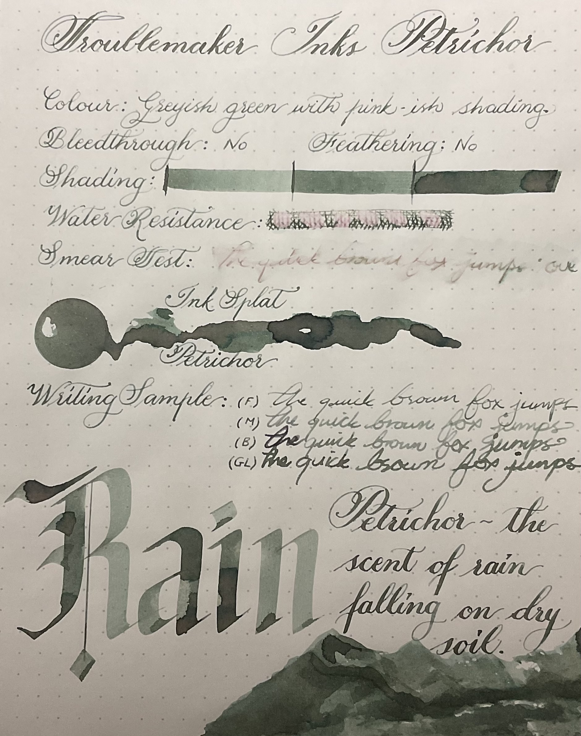
This ink is slightly on the drier side, but exceptionally well behaved. Even with heavy ink on the paper, and multiple layers it barely bleed though, and nothing on the page below it. I don’t foresee this ink bleeding through with any kind of normal writing even if the pen is a wet noodle.

The water resistance is better then I expected, but although the pink portion of the ink stays on the page its not very legible. It is easy to wash out, and the best part about this ink besides the colour is that it does not smear. Smearing inks are a pet peeve of mine, so whenever I use an ink that has such unique shift in colour – but doesn’t smudge it makes me very happy.

Rain Shading Up Close

Troublemaker Inks Petrichor Ink Splat
The ink seamlessly blends from colour to colour switching between muted pinks and intense greys all in one ink splat. If I had to pick a single colour category for this ink I would choose grey, but its so much more then that. I honestly have nothing like this colour in my collection. The shading is excellent even in fine nibs, but I would defiantly recommend a broader wet nib to get the best pinkish green effect.

Troublemaker Inks Petrichor Top Page Review
This is an incredibly difficult ink to capture because of all the subtleties in colour and it defiantly looks better in person. If you like greenish moss greys and oyster pinks, you’ll love Petrichor, but if blues and baby pinks are more your thing – get Abalone instead. (That is of course if you only want one….)

Troublemaker Ink Review Bottom
On Endless Paper, with a very wet nip the pink in this ink becomes more peachy, giving this ink yet another colour variation. With a fine nib the pink almost completely disappears, this is probably due to the fact that the paper is more cream then white.
What do you guys think about troublemaker inks?
As always this ink can be found here:
https://writegear.co.za/product-category/inks/fountain-pen-inks/troublemaker-inks/
M
