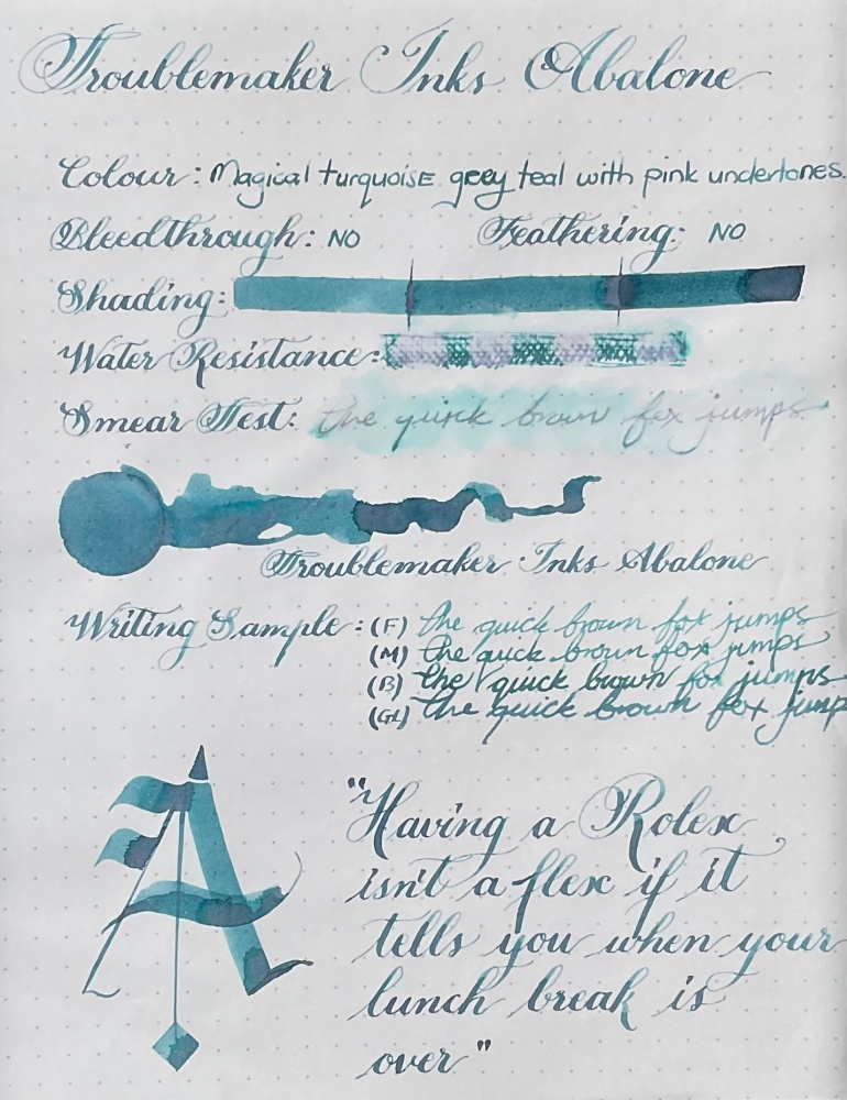
Troublemaker Shading Ink colours have really impressed me, this is the second ink in the range that I am trying and I’m already planning to add more. They have this unique ability to give colours more character. I love love love this colour, did I say love enough? It’s a midtoned green blue slightly teal colour, with this beautiful dusty pinky purple that splits out while creating a darker border around it. It is an absolutely stunning colour with a lot of depth to it, and really does draw you in. It reminds me of the ocean with the different play of colours – I think this ink will make a fantastic art ink. This colour was exceptionally difficult to capture with my phones camera.

Troublemaker Inks are an artisanal ink studio in the Philippines and as with Petrichor, this is a very well behaved ink. No bleedthrough even in very wet writing – but the ink drop did had a few dots that come through. This ink gives both a dreamy feel but can also feel moody, which just enhances it even further. Its a weird thing to say right – that the ink gives a feeling? But then again, all my favorite inks seem to do that – it’s not just about being a pretty colour.

The colour shift is not caused by a sheen, which is how many of my other inks get there colour shift, because of this I get zero smudging, zero. This just makes me love the ink even more, because inks that smear and smudge long after they’ve dried drive me a tad crazy.

The box has a clean and simple feeling, similar in size to the plastic diamine bottles with a decent sized openeing. Once again I wish the bottle were glass, but it is what it is. If you would like a more detailed view of the packaging – I have the Petrichor post linked. https://stationeryramblings.wordpress.com/2021/09/15/troublemaker-inks-petrichor/

I have nothing that really compares to this ink in my collection. You do need a broader, wetter nib for the ink to have more character, but even in a medium nib the shading is there. The water resistance is also surprisingly good, the blue tones disappear, but the writing underneath is still perfectly legible.

The one thing I have noticed (for both inks) is that white paper gives the best effect with these inks. The cream colour of Endless paper tends to mute the colour, the shading is still great – but the colourshift becomes much less visible and more typical. Rhodia/white paper is defiantly the way to go with this ink.

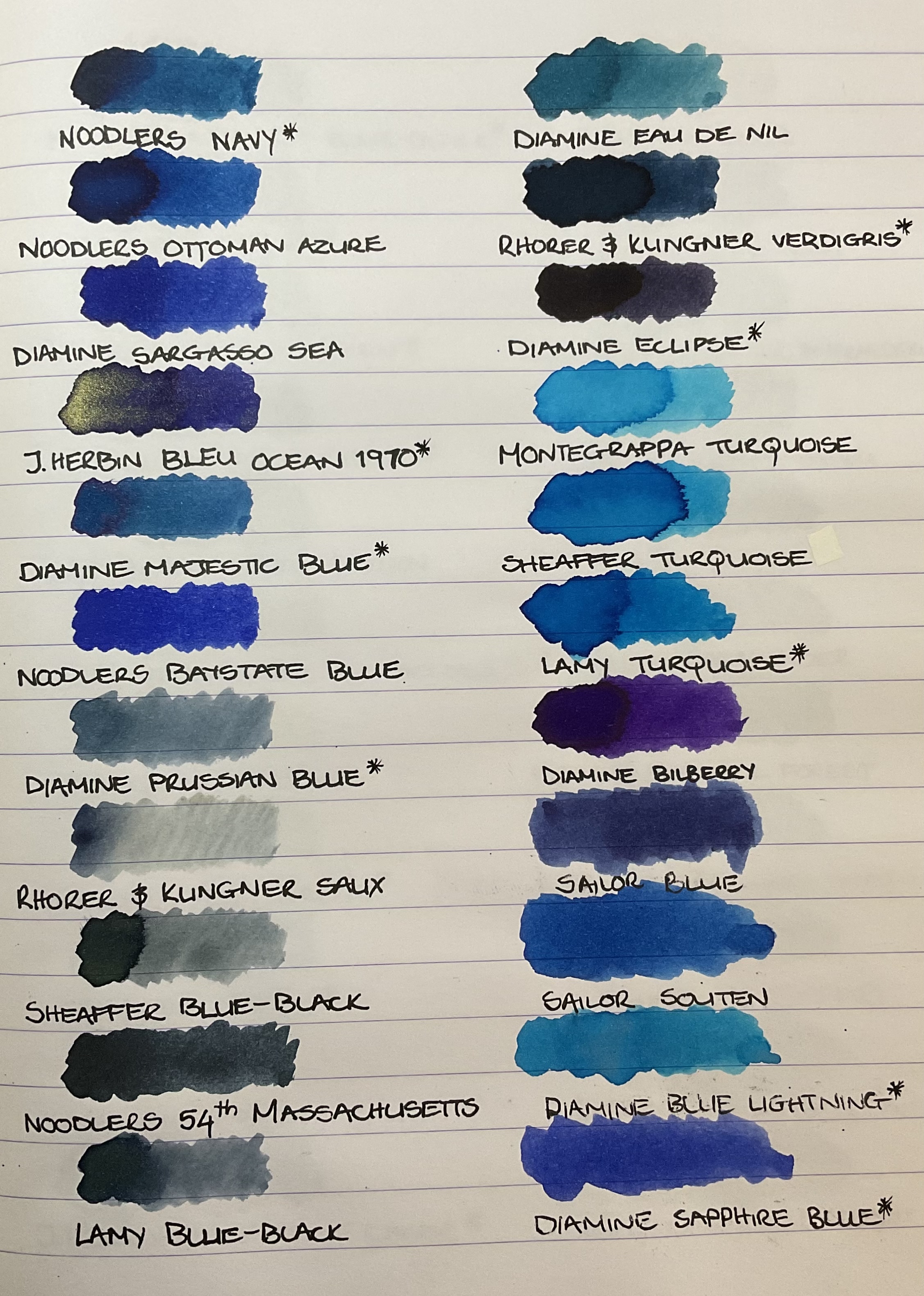
As with all these types of inks, actual writing with a fountain pen vs the more artistic applications will determine how dramatic the colourshift is. Below you can see swatches of all the blue inks in my collection, and none of them are a good dupe for this colour.

As always, it can be purchased here: https://writegear.co.za/product-category/inks/fountain-pen-inks/troublemaker-inks/
M
This post is not sponsored and all opinions are my own.
